
A well-considered colour palette can do more than make a dinner table look beautiful. It sets the mood for the evening, creates cohesion between the tableware, flowers and linens, and gives even the simplest gathering a sense of occasion. The trick is not to match everything, but to choose a few shades that work together and allow the rest of the table to follow.
For our Ultimate Dinner Party series, these are the colour combinations worth considering.

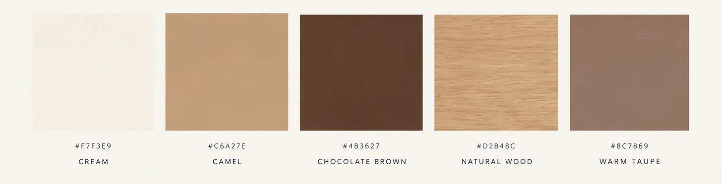
Warm Neutrals
Cream, camel, chocolate brown, and natural wood
For a dinner party that feels relaxed but considered, warm neutrals are difficult to beat. Think linen tablecloths in ivory or oatmeal, wooden serving boards, brown-toned ceramics, and candlelight.
This palette works particularly well for long, leisurely dinners where the atmosphere is meant to feel intimate instead of formal. Layer different textures such as linen, stoneware, wood, and glass to keep the neutral scheme from feeling flat.
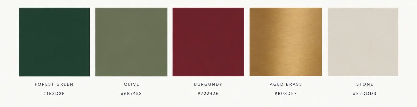
Deep Green and Burgundy
Forest green, olive, burgundy, and aged brass
Deep greens and wine-reds bring warmth and depth to the table, particularly after sunset, while brass or antique gold adds a subtle note of glamour.
As opposed to introducing every colour equally, let one shade dominate. A green tablecloth, for example, can be paired with burgundy napkins, clear glassware, and simple greenery.
Darker palettes are also well suited to intimate dinners, where low lighting and candlelight can enhance the richness of the colours.
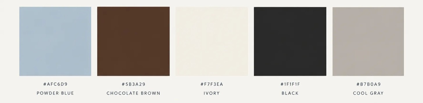
Powder Blue and Chocolate
Soft blue, chocolate brown, ivory, and a touch of black
For something less expected, try pairing a cool powder blue with rich chocolate brown. The contrast gives the table a contemporary feel without becoming too bright.
Use blue through linen or glassware, then ground the palette with brown ceramics, wooden serving pieces, or darker furniture. Keep the remaining elements quiet with ivory plates and simple flowers.
Unexpected colour combinations are used to create tables that feel collected rather than overly coordinated.
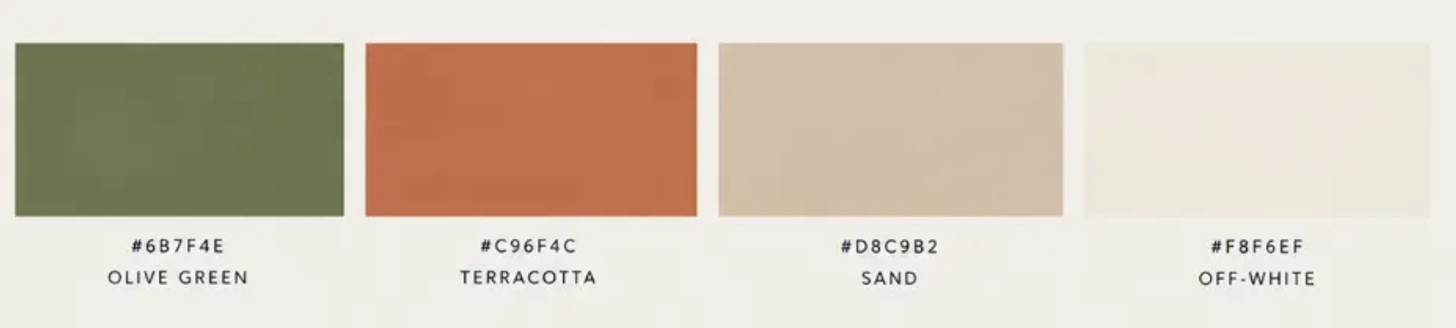
Olive Green and Terracotta
Olive, terracotta, sand, and off-white
Inspired by the natural world, this is an easy palette for an outdoor dinner or a gathering that moves between the garden and dining room.
Terracotta brings warmth, while olive green keeps the colours grounded. Add woven textures, stoneware, and seasonal foliage to reinforce the earthy quality of the palette.
It is also effective when the setting itself becomes part of the tablescape – allowing garden greenery, timber, or natural stone to contribute colour without adding another decorative layer.
Monochrome, Done Properly
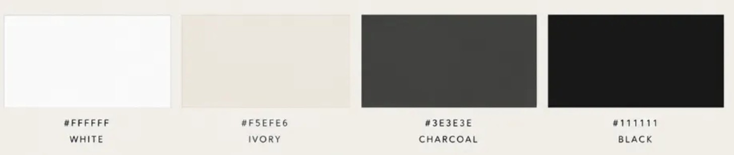
White, ivory, charcoal, and black
A monochromatic table does not have to mean stark minimalism. The interest comes from variation within the same colour family.
Try crisp white crockery against ivory linen, smoked, or clear glassware and charcoal accents. Black cutlery or candleholders can provide definition without overwhelming the table.
The key is texture. When the colour palette is restrained, linen, ceramics, glass, and polished metal become more important.
Butter Yellow and Burgundy
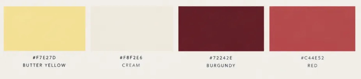
Butter yellow, cream, burgundy, and a little red
For something brighter, combine a soft butter yellow with a deeper burgundy.
Keep the foundation neutral – perhaps a cream tablecloth and white plates – and introduce the stronger colours through napkins, flowers, glassware, or candles. A limited palette of two or three dominant colours together with an accent is an easy way to keep a tablescape cohesive.
The Three-Colour Rule
If choosing a palette feels overwhelming, start with three colours: one dominant shade, one supporting colour, and one accent.
Your dominant colour might appear in the tablecloth or crockery; the supporting shade can come through napkins and flowers; and the accent can be as small as a candle, piece of glassware, or place card.
Most importantly, don't make everything match. The most inviting tables tend to have a little variation – vintage pieces alongside contemporary tableware, different textures, and objects that feel collected over time. After all, a dinner party should feel like an extension of the host, not a showroom.
Image Credits: via AI


