
Milan Design Week is much more than a furniture design fair. Every April, the city becomes a charged meeting point for design, architecture, commerce, collecting and cultural influence, where objects gather meaning through the places, people and narratives arranged around them.
This year, the strongest work made that chemistry visible. Hannes Peer built complete material worlds. Annalisa Rosso, Nina Yashar and Federica Sala shaped the cultural frame through editorial intelligence, collecting and curation. OKHA carried its distinctive studio language into three global collaborations. Major brands used Milan’s architecture as theatre, while Vincenzo De Cotiis offered a darker, mineral vision of matter transformed.

Who is Hannes Peer?
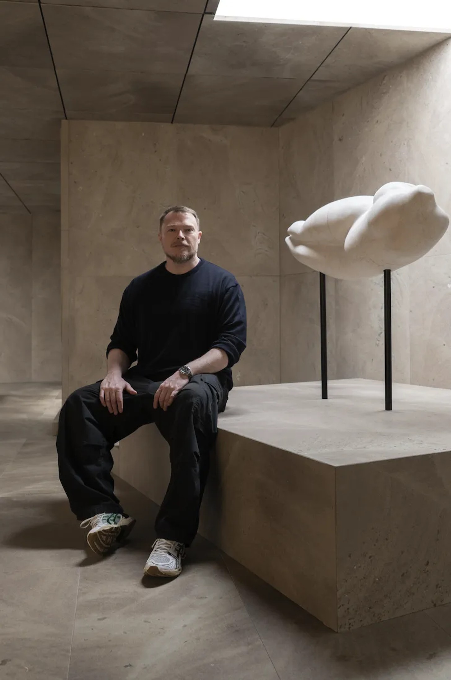
Milan has always rewarded designers who create recognisable worlds around their practice. This year, Hannes Peer’s projects registered as a consolidated statement. Across furniture, marble, glass and ceramics, he put forward a highly authored proposal for space, materiality and atmosphere, one that carried awe, permanence, richness, tactility and human connection.
Trained as an architect, Peer moves between residential interiors, hospitality, collectible design and installation with peak fluidity. Historical references appear throughout his work. Periods collide with looseness and confidence: modernism beside decorative gestures, sculptural forms alongside disciplined architectural structure. Richness and rigour, memory and futurism co-exist naturally together.
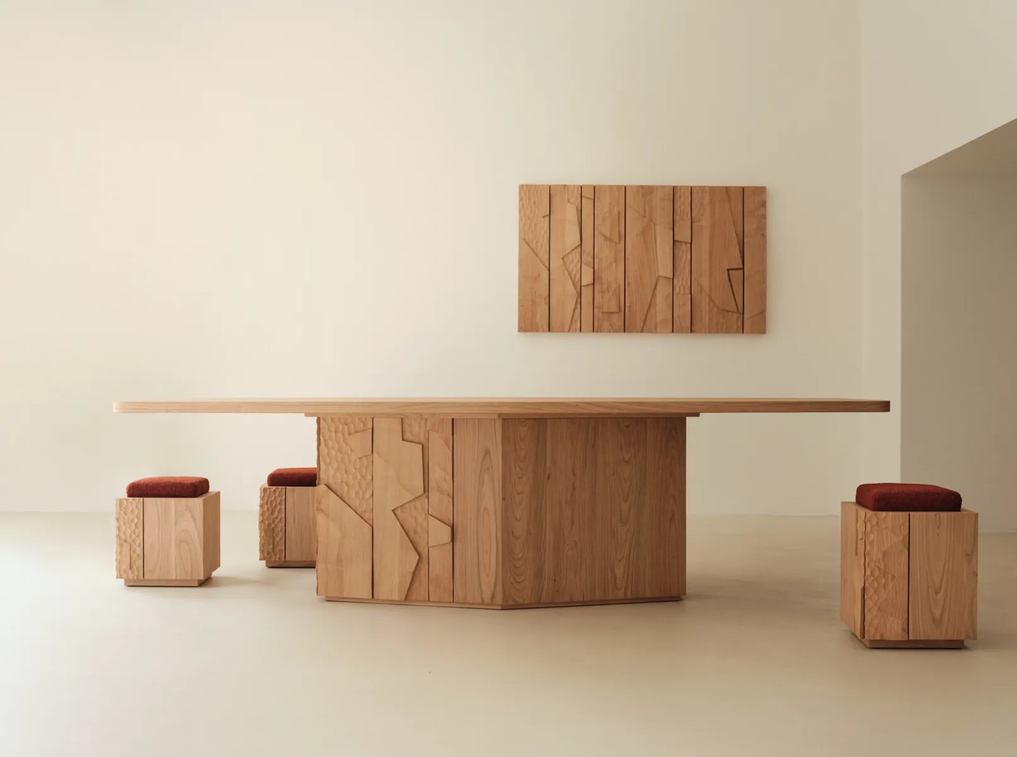
The blend is pure poetry. For SEM, the Italian woodworking company presented at Spotti, one of Milan’s most discerning design destinations, Peer created a collection with a richness and complexity that resisted quick reading.
The Core collection comprised monolithic tables, chairs and a staggering oversized cabinet in solid mahogany, rosewood and cherry, with carved facades drawing from modernist architectural and brutalist sculptural traditions – not carving furniture language. A pedestal cabinet, softly geometric dining table and wall panels became both object and artwork.
Historical reference, materiality and atmosphere folded into one another with complete confidence. Margraf’s La Casa di Marmo carried a similar charge. Marble, so often reduced to surface and luxury shorthand, was repositioned as a total architectural element, shaping walls, floors and ceilings into an immersive environment generated from a singular material logic.
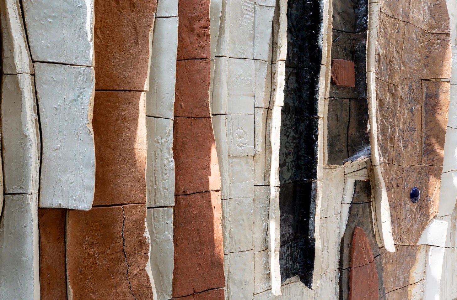
Hidden beneath a historic villa in Brera, visitors descended into a mineral universe organised around a central patio where light and water continually sculpted stone and shifted perception. His ceramic panelled work with Offi cine Saffi – a nonprofit devoted to the exploration of global ceramic craft - moved beyond objectmaking into a sculptural landscape of pods and panels in a vertical application.
Across these projects, the collaborations formed a single language translated through different materials. Peer describes his own work as eclectic, architectural and narrative. It is a useful entry point into the practice, although architecture remains the key. Even when designing a chair or a table, he thinks spatially.
His work proposes complete systems of atmosphere. Materials operate as instruments rather than finishes. Marble becomes architecture. Glass becomes perception. Ceramics become landscape. Furniture becomes spatial intervention. Beneath the spectacle, a larger proposition is taking shape: furniture, interiors, architecture and material research can operate as one field.
Milan sharpened the relevance of that approach. The city’s strongest presentations favoured environments over objects, places designed to be entered as much as viewed. Across the city, installations became immersive, materialled and suff used with feeling. Peer’s presentations set the direction, giving Milan’s prevailing shift its clearest and most complete expression.
The Cultural Operators: Three Women Shaping the Milan Zeitgeist
Milan’s influence is distributed beyond designers. Editors, curators, gallerists, academics, intellectuals and yes, marketers often decide what sits beside what, and what attention is being paid where.
Annalisa Rosso has become one of Milan’s defining cultural operators. Her importance comes from the way she moves across editorial direction, institutional programming, cultural strategy and market intelligence. She reads design as industry and culture at once, then builds the frameworks through which others can read it too.
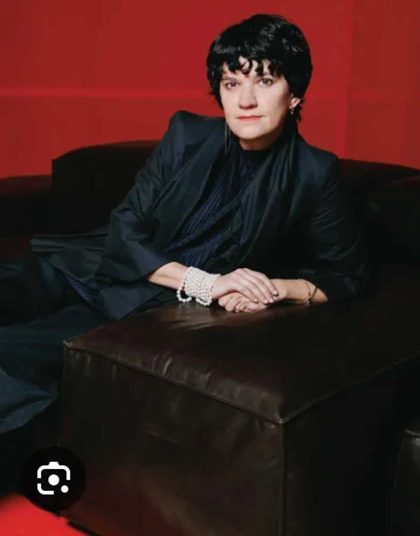
Every Design Week develops its own chorus of voices. Founders unveil collections, editors declare trends, galleries stage spectacles and designers compete for attention. Within that flood of opinion, a handful of people quietly determine how the city thinks about itself. Rosso gives Milan’s design industry a sharper language for its cultural ambitions
In her role as Editorial Director and Cultural Events Advisor at Salone del Mobile, Rosso has helped expand the fair beyond its traditional function as an industrial marketplace. Under her influence, Salone increasingly behaves like a cultural institution, bringing together architects, thinkers and artists through programmes that have included figures such as Shigeru Ban, Francis Kéré, Hans Ulrich Obrist and John Pawson.
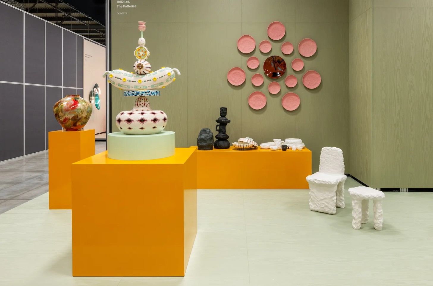
Her clearest recent statement arrived through Salone Raritas, a new platform introducing collectible and limited-edition design into the centre of the fair itself. For years, collectible design existed largely on Milan’s edges, dispersed through galleries, palazzos and Fuorisalone events. Rosso pulled it inside the institution.
The name itself is revealing. Instead of adopting the market’s existing terminology, from collectible design to design art and functional sculpture, she chose Raritas, the Latin word for rarity. In explaining the project, Rosso argued for a broader idea: rarity as a quality that introduces identity, experimentation and cultural value into an increasingly uniform world.
Rosso’s value lies in her insistence on meaning. Milan Design Week can easily be overwhelmed by scale and spectacle. Thousands of launches compete for attention. Installations grow larger. Experiences become more immersive. Rosso keeps returning to a quieter, more necessary question: what cultural meaning sits beneath the object?
The people who define Milan often work before the spectacle begins. They shape the conversation everyone else enters. Nilufar Depot has become one of the annual rites of Milan Design Week because Nina Yashar has become an institution in her own right, known for the originality of how she sees. The annual journey to Nilufar has become a pilgrimage because Yashar’s installations are built on unexpected adjacencies, tensions and harmonies assembled with instinctive confidence. There is also something deeply Milanese, uniquely Milanese about it.
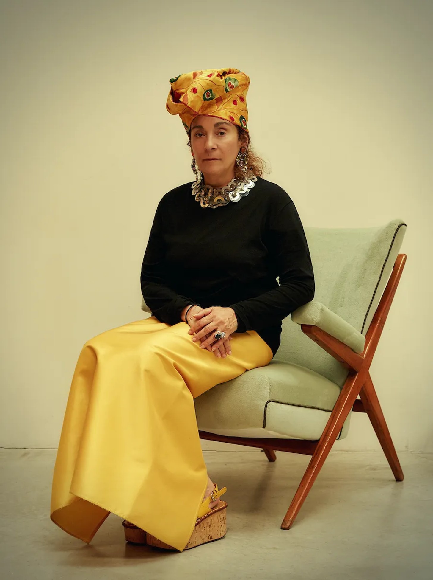
Grand Hotel, staged inside Nilufar Depot, was optimised world building.. Vintage pieces, contemporary works and Nilufar Editions were layered into an imagined hotel environment, a richly coloured, expressive, rational, velvet and silky- sensual Milanese orchestration of spaces in which to receive and retreat.
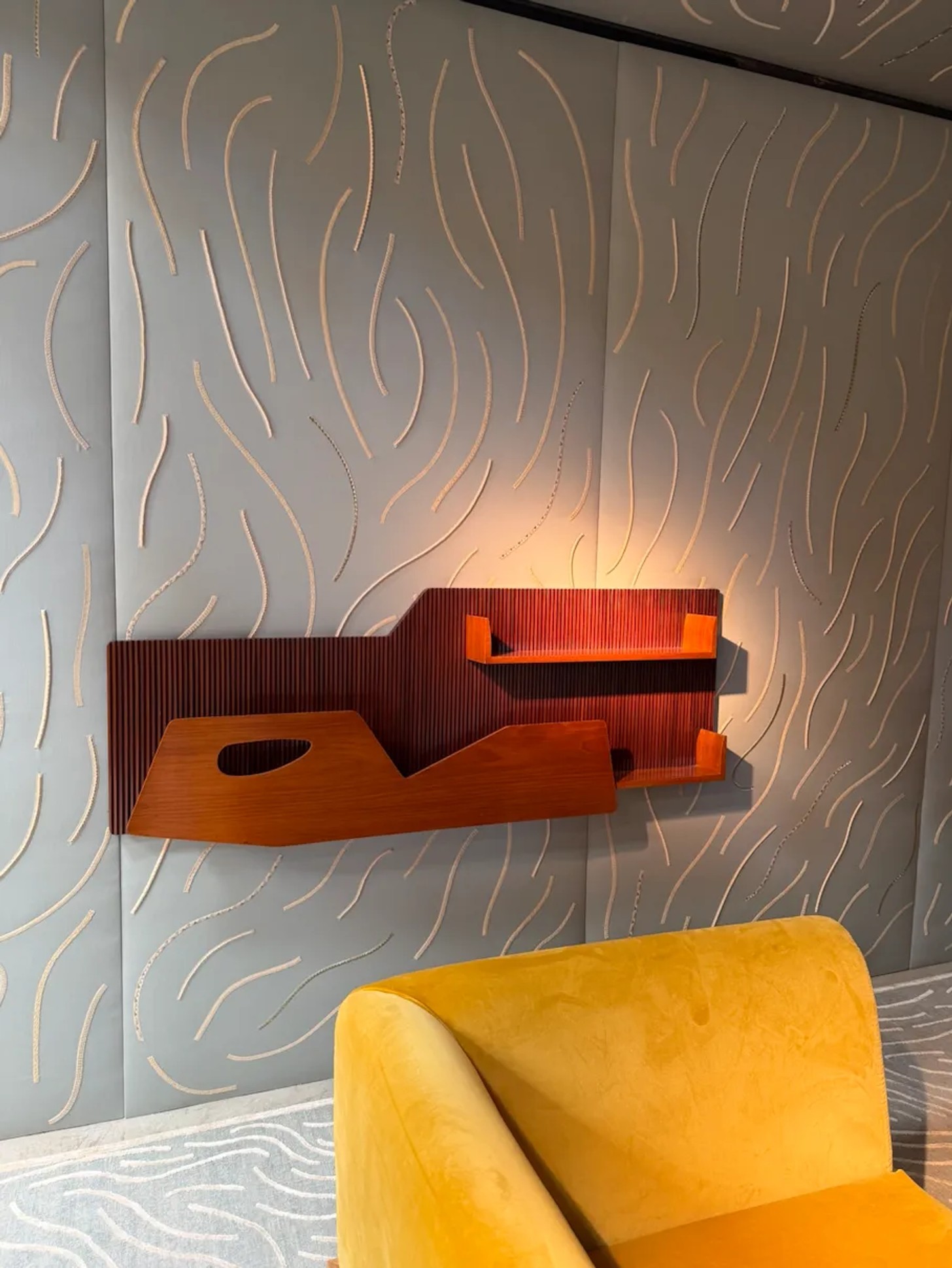
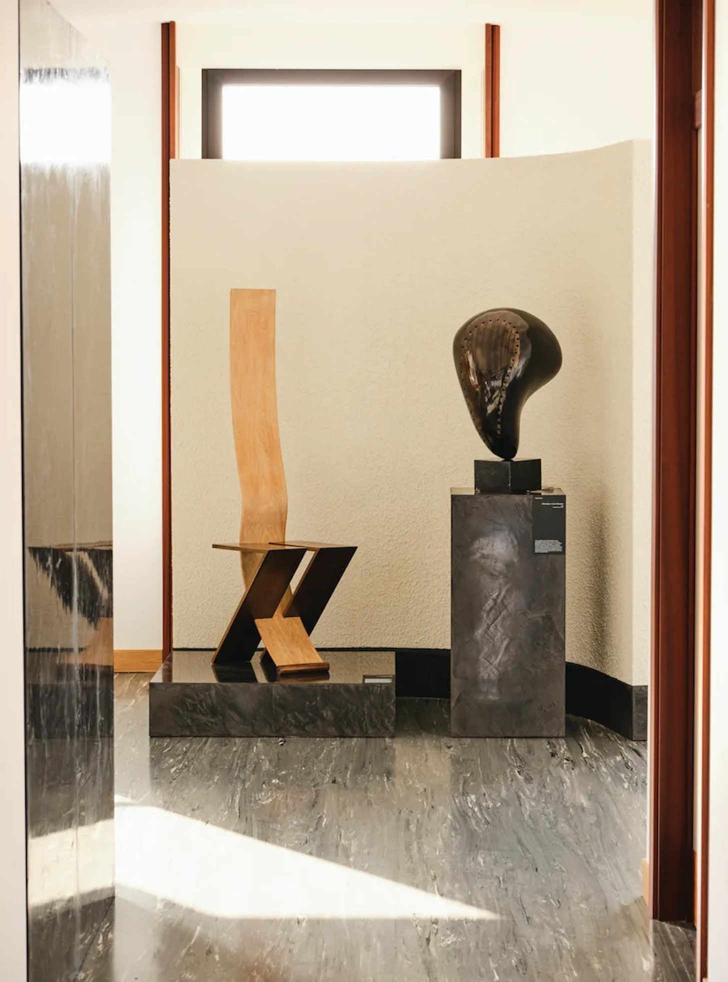
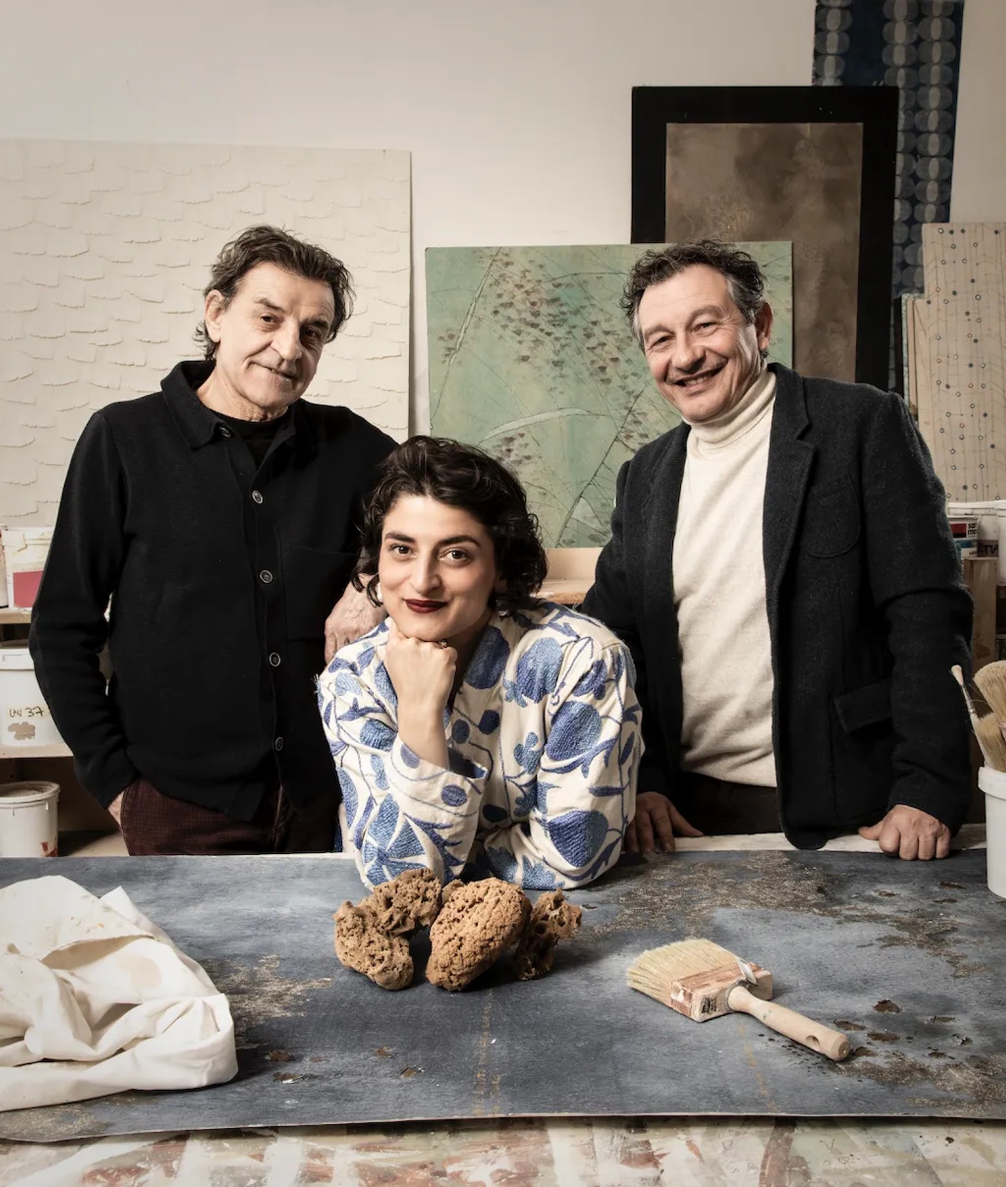
Federica Sala’s curatorial practice is shaped by a sustained interest in design as a carrier of culture, memory and identity. Working across exhibitions, interiors, cultural projects and research-driven collaborations, she approaches design as a language through which broader social and geographic narratives can be explored. A recurring thread in her work is the creation of dialogue between Milan and external cultural perspectives. Sala often constructs exhibitions around deeper cultural frameworks: folklore, craft traditions, material histories, ritual and contemporary identity all become part of the conversation.
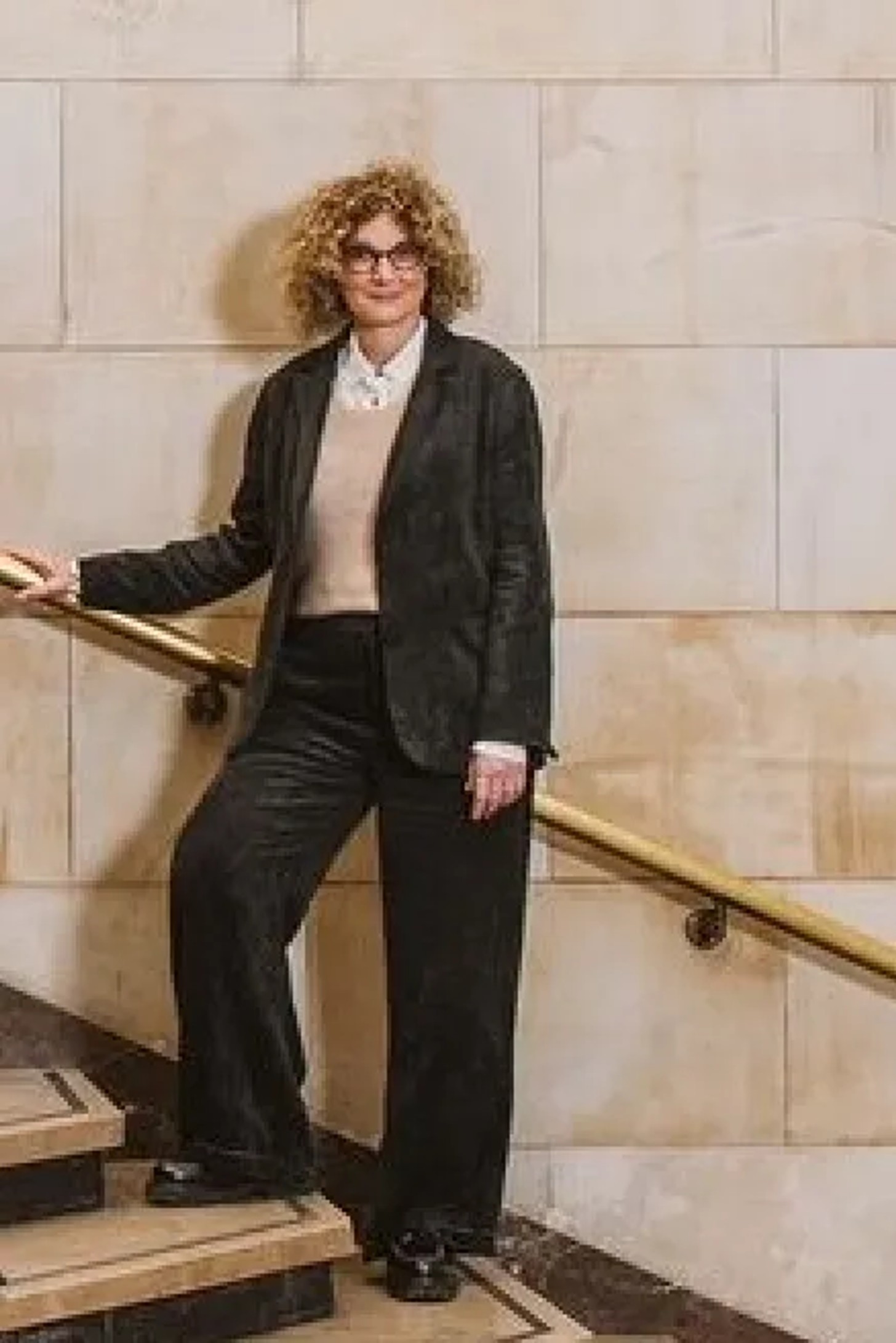
This approach was particularly evident in Romantic Brutalism: A Journey into Polish Craft and Design. The exhibition explored Polish contemporary design through the lens of cultural memory, connecting contemporary work to folklore, post-war modernism and inherited craft traditions. Scenography, materiality and atmosphere worked together to create a rich and highly stylish understanding of Polish creative identity.
For Sala, this expanding international presence reflects a broader shift in Milan itself. While the city remains the world’s most important design gathering, she believes its role has evolved beyond commerce and industry. “Design is a language,” she explains. “A daily language we live with. Or even better, we sit on it, sleep in it, eat on it.” Through that lens, design becomes a means of reading societies, cultures and ways of living. She points to the growing number of international foundations, cultural institutions and ministry-backed initiatives participating during Design Week as evidence of Milan’s changing role.
Once centred primarily around industry, the city increasingly functions as a cultural platform where different design geographies can be presented, interpreted and understood. Comparing the phenomenon to the international exchange traditionally associated with the Venice Biennale, Sala sees Milan emerging as a place where design operates as a form of soft power, revealing how different cultures express themselves through the objects and environments they create.
Underlying much of her practice is a belief in Milan as a place of encounter. “People from all over the world come to Milan to see friends, meet clients, buy furniture, have new ideas, drink and dance,” she says. “The energy is unique.” It is this concentration of people, perspectives and cultural exchange that continues to shape both the city and her work within it.
The City as Stage
Major corporate brands use Milan Design Week differently. Design, creativity and collectability give them an abstract language through which to express brand culture. Here, the city’s historic architecture becomes part of the message. This is one of the singular qualities of the week: product becomes atmosphere, brand becomes experience, and commerce is recast through architecture, poetry and memory. Some are great. Some are gratuitous.
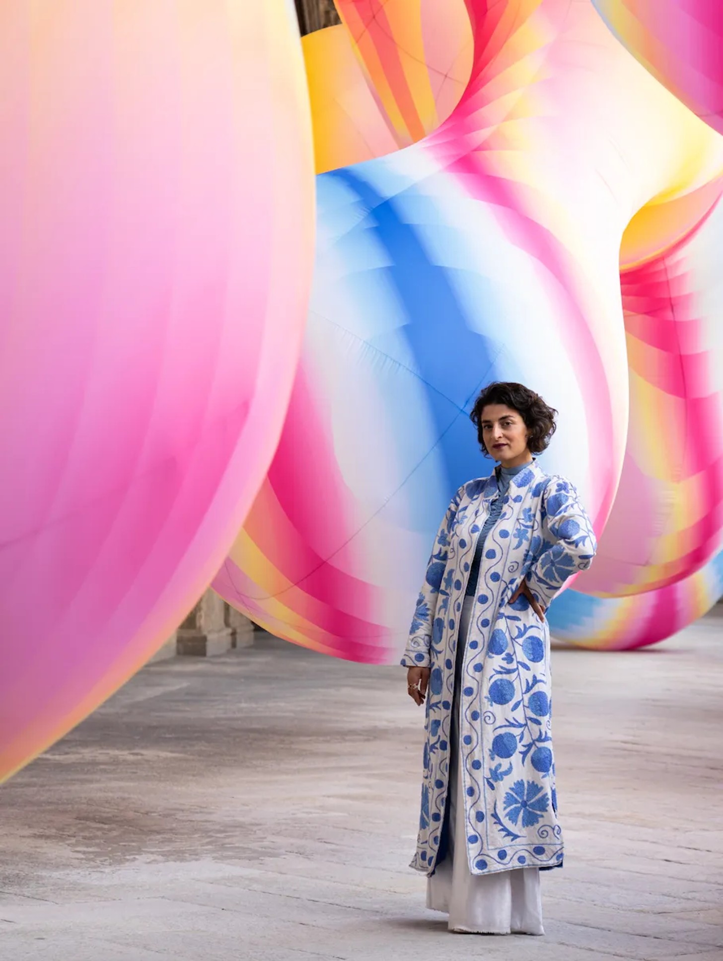
Milan-based artist and creative director Sara Ricciardi brought American Express into the architectural theatre of the city with Serotonin: The Chemistry of Happiness, an immersive installation set in the Loggia of the Pinacoteca di Brera. Known for a practice in which, as she puts it, “form follows poetry,” Ricciardi works through narrative, material research and collaboration with Italian master artisans to create environments that feel more like emotional propositions than conventional design displays.
For American Express, this translated into a poetic spatial statement about pleasure and emotional reward. Literal branding receded and the installation used Milan’s architecture as a stage for abstraction. Inflatable forms produced a visceral response, while light, colour and sound shifted through the space, creating a living landscape suspended between euphoria, contemplation and sensory immersion.
It is interesting that these big brand activations are often discussed in the same breath as pure design presentations. Gucci’s vending-machine lark seemed to draw as much attention as cc-tapis’ collaboration with Fornasetti, which says something about Milan’s strange democracy of spectacle.
Another really successful use of the city came through Kelly Wearstler’s collaboration with H&M Home. Faultless, generous and celebratory, it understood Milan’s particular magic. This was Wearstler’s Milan debut and H&M Home’s first designer collaboration to include furniture, with a collection built around small modular pieces that can shift, expand and gather into larger arrangements.
The installation was staged at Palazzo Acerbi, a near-mythic 17th century Baroque palace long closed to the public. Behind its austere façade, the rooms opened into theatrical grandeur, giving Wearstler’s contemporary forms the right degree of friction. The building gave the collection scale and drama, and the collection activated the rooms.
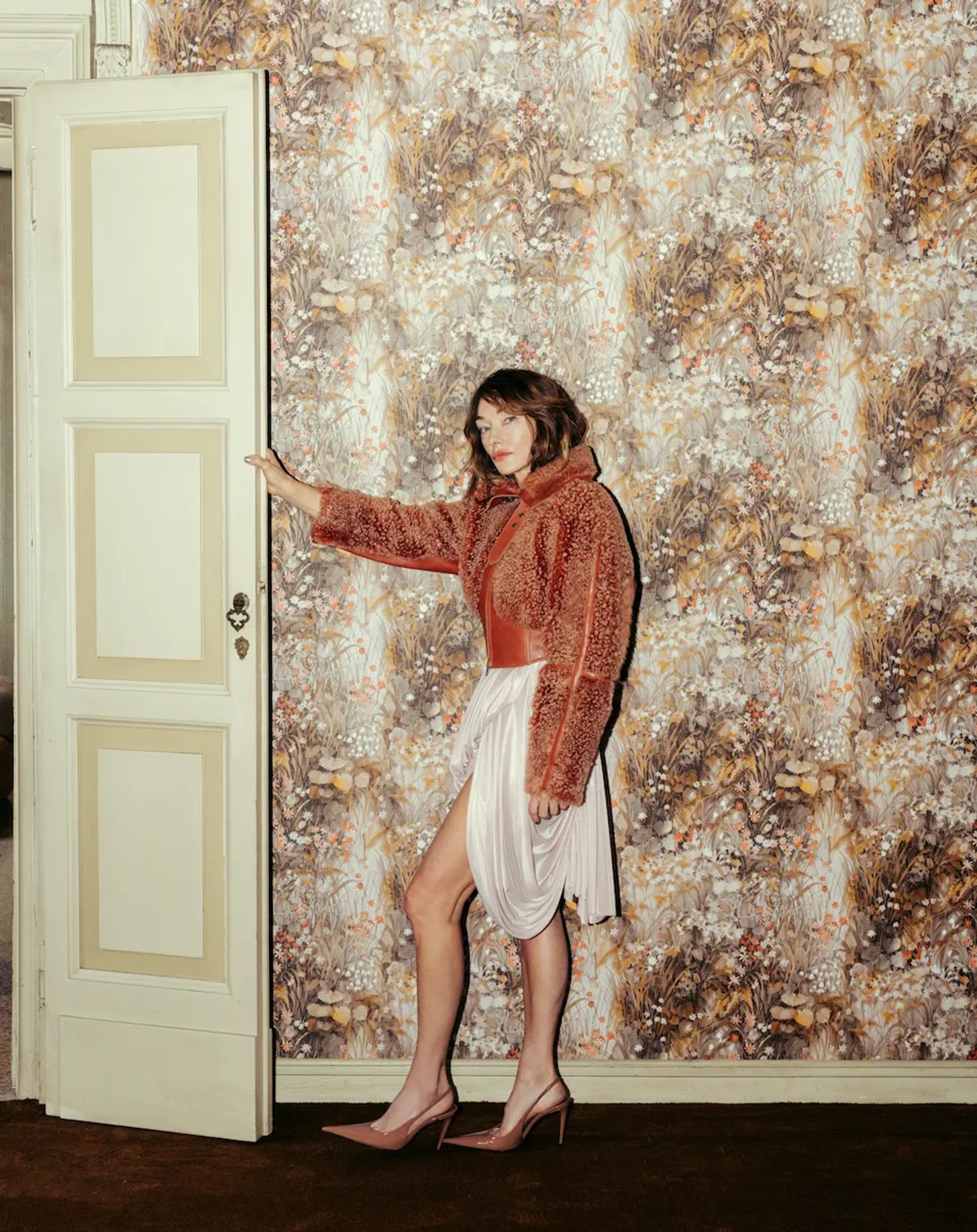
“I couldn’t have asked for a better partner or a more extraordinary stage,” Wearstler said. “Palazzo Acerbi stopped me the moment I walked in. Centuries of history, our collection in direct conversation with all of it. Bringing this collection to life in Milan and showing people how these pieces come alive in a real space, that’s everything.”
Produced by Studio Boum, the presentation unfolded as a choreographed journey through rooms, objects and daily rituals. Each space carried a different register of use and atmosphere, allowing the furniture and design pieces to be seen as part of lived experience. The strongest moments were those where the collection felt absorbed into the architecture, with pattern, surface, scale and setting all doing the work.
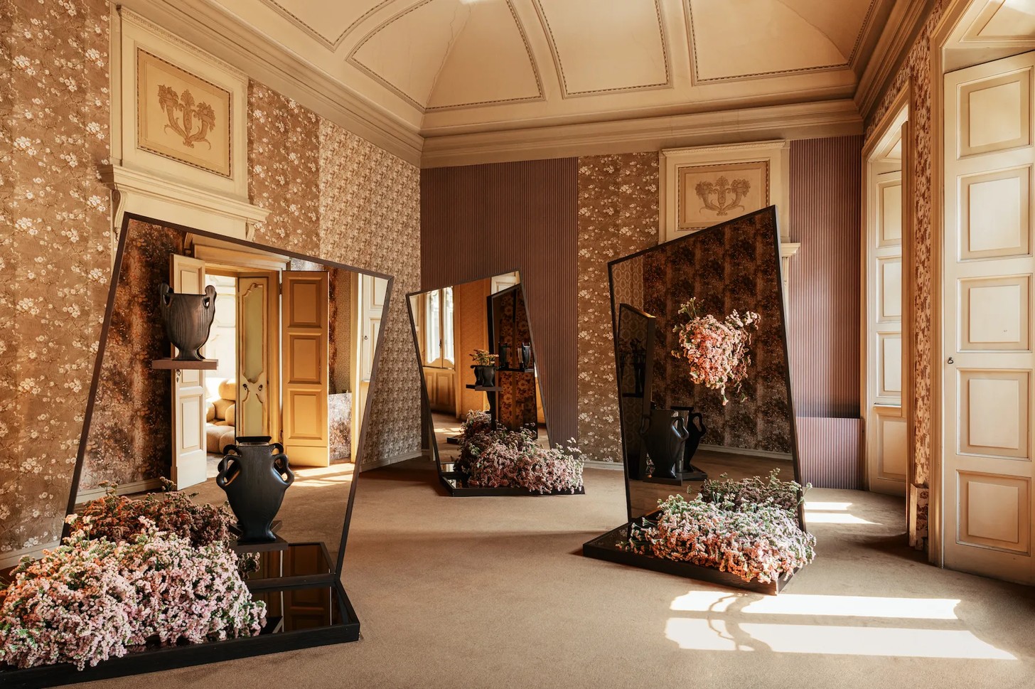
The Milan presentation featured nine objects from the wider 29-piece collection, enough to suggest the range and its logic. It was a clear example of how a major retail brand can use Milan well: by entering the city’s architectural imagination and allowing the place to deepen the story.
Master of Matter
Milan Design Week is also where the giants of design surface each year. Away from the noise, there are figures whose work carries the authority of a lifetime, and Vincenzo De Cotiis belongs firmly in that company. An artist and architect based in Milan, De Cotiis has, since the late 1970s, developed one of the most distinctive languages in contemporary collectible design.
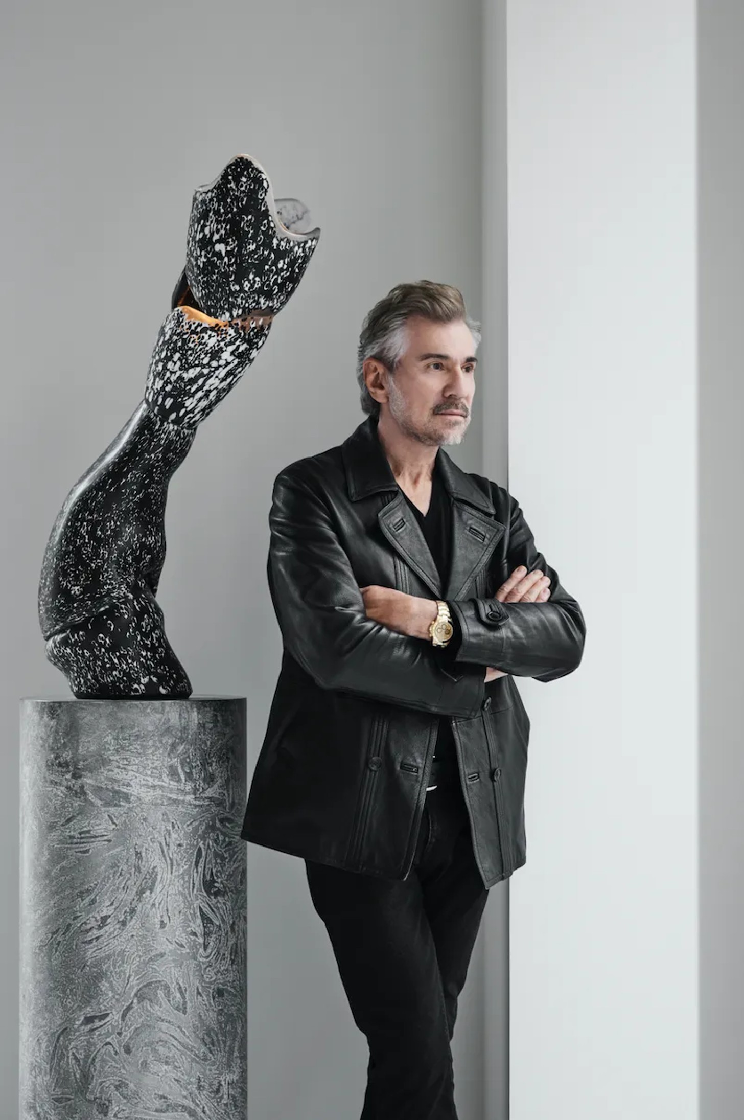
His work is instantly recognisable for its command of material. Metal, stone, glass, resin and recycled elements are layered, altered, fractured, repaired and brought into a state of charged balance. His surfaces resist polish and obedience. They carry the evidence of transformation, as though matter has passed through pressure, erosion, accident and time.
For 2026, De Cotiis presented “Je suis la Mati.re: Cosmos, couleur invisible et traces d’infi ni,” an exhibition conceived as an open system of works in constant motion. The series takes its cue from cosmic rocks, their stratified structures and fragmented patterns translated across metal, Murano glass and recycled materials. As the language shifts from one medium to another, boundaries begin to blur. Metal assumes the mineral logic of meteorites. Glass carries the same fractured rhythm. Surfaces overlap, merge and become difficult to separate.
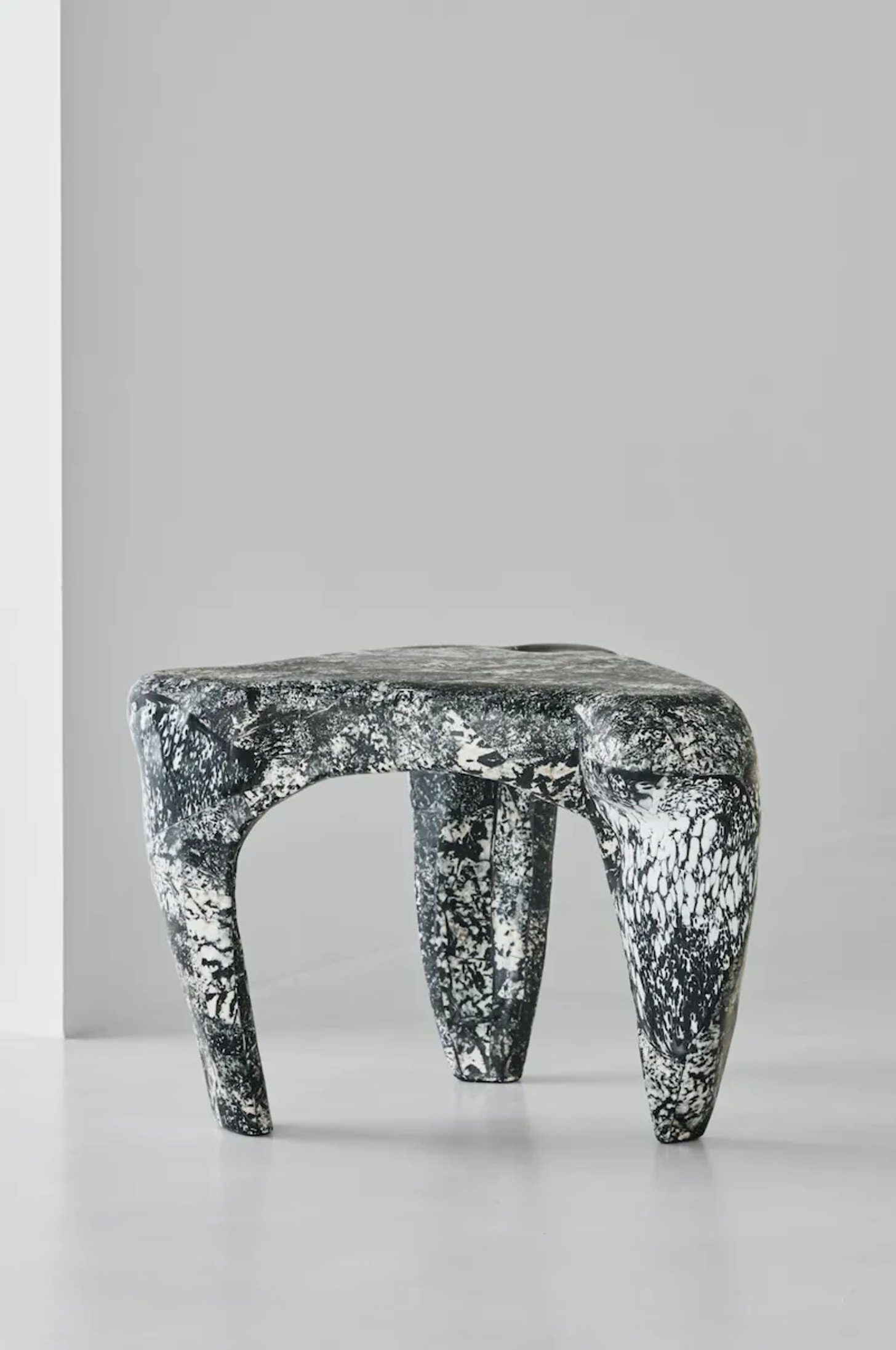
At the centre of the project is a meditation on what is visible and what remains latent. By reducing the palette to black and white, De Cotiis draws attention to what he calls a “couleur invisible” – a hidden colour or presence held inside the surface. The effect is restrained but expansive, as if each work contains traces of some larger, unknowable system.
There is always precision beneath the apparent spontaneity of De Cotiis’ work. Form appears to emerge from matter itself, shaped by internal tensions, ruptures and accumulations. The pieces seem suspended between object and organism, fixed and shifting, ancient and newly formed. In Milan, this kind of encounter matters. It reminds you that beyond the launches, activations and spectacle, the city is still a place where the masters show us how far material can be pushed, and how much meaning it can hold.
A Language in Translation
South African design story to emerge from Milan this year came from OKHA where Creative Director Adam Court's design language appeared in three distinct interpretations, with three different brands each carrying a recognisable OKHA language of sculptural form, materiality and emotional resonance.
Forma Lenta, a collections of chairs, daybeds, tables and benches was the most complete articulation of this. Presented within a SAOTA designed pavilion (the first time an African architectural practice has exhibited in Milan) in collaboration with Yardcom, the collection proposed a slower and more architectural reading of outdoor furniture.
“For me, it’s about continuity,” reflects Court. “The pieces are designed to sit within a space in the same way architecture does, through proportion, alignment and material. They’re not conceived as separate objects, but as part of a larger spatial condition, especially outdoors, where the boundary between building and landscape is less defined.”
Bronze-finished aluminium with etched surfaces introduced an unexpected richness and tactility, while the forms themselves felt measured and deliberate, as though designed around transitions, thresholds and the movement of light rather than simply function.
“The finishes allowed the work to move beyond a purely performance-driven expression,” says Court. “The material still needs to endure, but it also carries a visual and tactile depth you don’t usually see outdoors. The etched finish softens the surface and changes how it interacts with light, so the pieces shift subtly over time, introducing a sense of duration closer to architecture, or even artefact, than conventional outdoor furniture.”
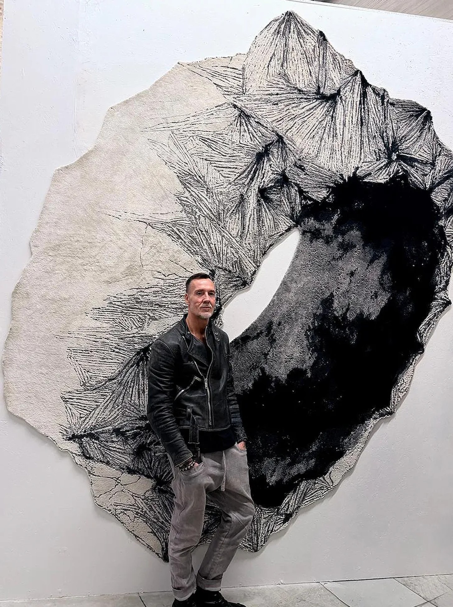
The third expression came through Henzel, where OKHA’s punky studded Clash language was translated into hand knotted rug form. Here, Court’s interest in tension, surface and structure moved into a softer but still graphic register. The rug carried the same sense of collision and controlled disruption as the wider Clash series, but reinterpreted through fibre, pattern and scale, it extended OKHA’s sculptural vocabulary into a more atmospheric plane - showing how the studio’s language can shift across object, furniture and textile without losing its underlying force.
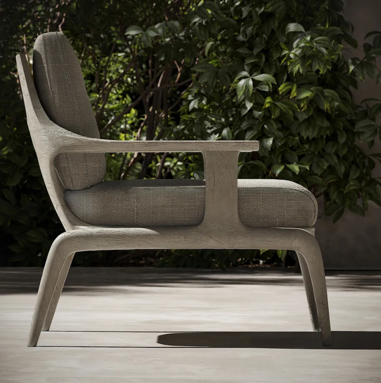
For SNOC, a leading Turkish outdoor brand, the Thara chairs shifted into an altogether softer register. Drawing on the atmosphere of the African savanna, the work explored openness and stillness through generous negative space and gentle curvature. There was a calmness in the silhouettes, but also a sensuality in the way the forms resolve themselves, particularly the backrest which carries a soft curvature reminiscent of the human back, giving the negative space a sculptural, sensual presence. For OKHA, the achievement was reach: the extension of a distinct design expression beyond the studio’s core collection and into a broader international conversation.
Credits
Images: Supplied


