
Spring has a way of making us look at our homes a bit differently. The light changes, windows stay open a little longer, and suddenly that room that felt perfectly cosy a few months ago is asking for something lighter, fresher – perhaps even a little more colour.
However, spring interiors don't have to mean a home full of pastel pinks, baby blues, and butter yellow. In 2026, the seasonal palette is taking a more considered turn. Designers are pairing fresh, nature-inspired shades with earthy neutrals, deeper greens, and unexpected pops of colour, creating rooms that feel optimistic.

For South African homes, there is plenty of inspiration closer to home, too. Fynbos greens, sun-baked earth tones and ocean blues are already emerging as defining colours in local interiors, giving the idea of a 'spring palette' a uniquely South African character.
Start with a softer neutral
Warm whites, chalky creams, sandy beige, and pale stone shades provide a calmer starting point than stark white or cool grey. They also work beautifully with the materials that are already having a moment in interiors – timber, linen, woven fibres, natural stone, and aged finishes.
Think of these colours as the background rather than the main event. They allow stronger shades to have their moment without making the room feel visually busy.
And unlike highly seasonal pastels, a warm neutral can carry a room well beyond spring.
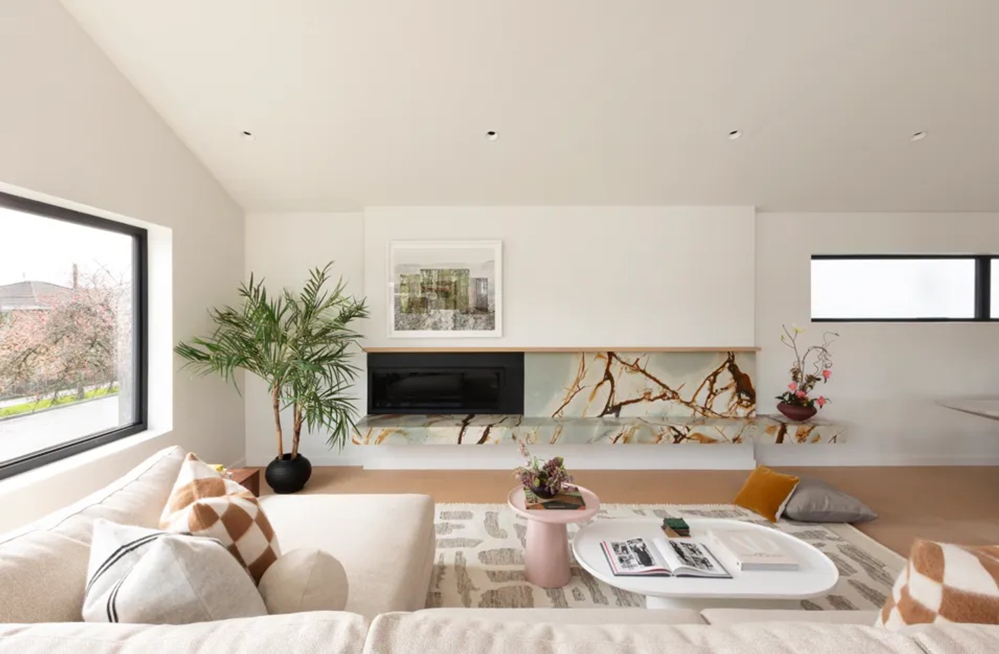
Green, but not necessarily sage
Green remains one of the easiest ways to bring the feeling of the outdoors inside, but there is more to explore than the universal sage.
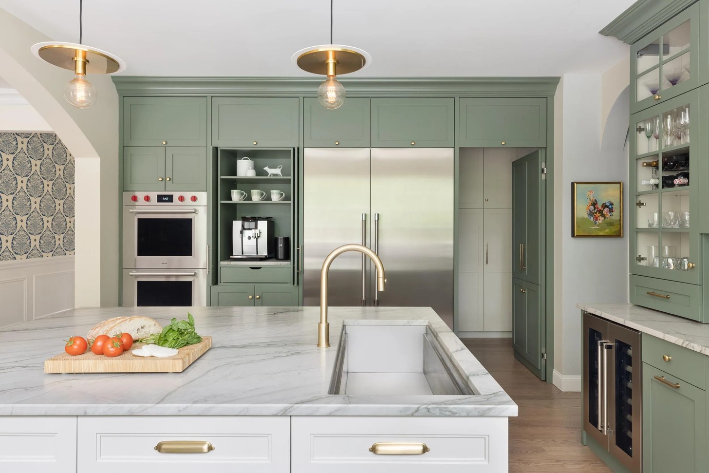
For spring, consider mineral greens, soft olive, moss, fynbos-inspired shades and even brighter botanical greens. The trick is to choose a green with some complexity instead of one that feels too artificial.
A muted green can become almost neutral when used across walls, while a more saturated shade works beautifully on cabinetry, a painted piece of furniture, or through upholstery.
Bring in a little terracotta
Terracotta might not be the first colour that comes to mind when you think of spring, which is the reason why it works.
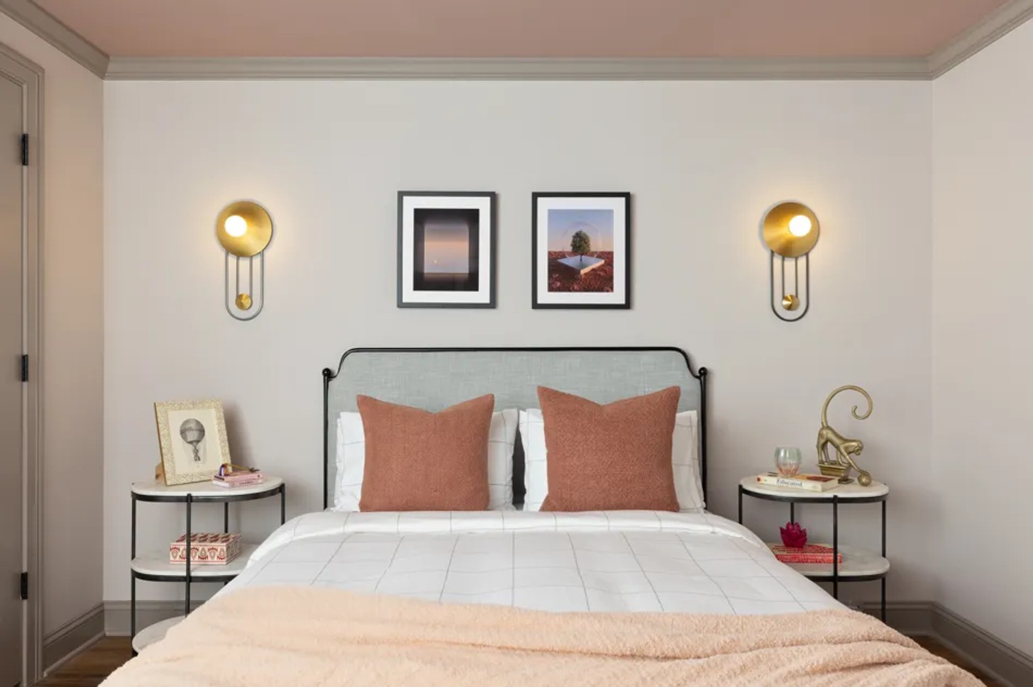
Pink-tinged clay, soft rust, terracotta, and sun-baked ochre can give a spring palette some much-needed grounding. They bring warmth without the heaviness of darker winter shades and sit naturally alongside cream, olive, blue, and timber.
There is also something particularly suited to the South African landscape about these colours. Used sparingly, they can reference the tones of the Karoo, desert landscapes, and sun-warmed earth without turning a room into a themed interior.
Pair terracotta with something unexpected – a cool blue, pale green, or soft pink – rather than surrounding it with more earth tones.
Let yellow bring the sunshine
Yellow has long been associated with spring, but the most interesting versions of the colour are becoming softer and more grounded.
Instead of an intensely bright lemon, look towards butter, pale ochre, muted marigold, and sun-washed yellow. These shades bring warmth and optimism while retaining enough restraint to work in sophisticated interiors.
Yellow doesn't have to take over a room, either. A ceramic piece, lampshade, cushion, artwork, or occasional chair can be enough to change the atmosphere.
Blue gets a warmer treatment
Blue is another spring staple, but this season it feels less sugary and more atmospheric.
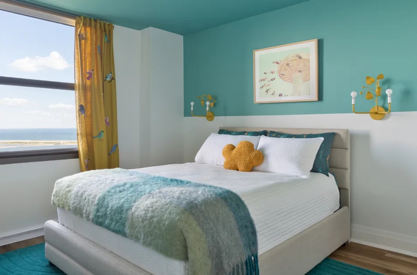
Soft sky blue can certainly work, particularly alongside warm white and natural timber, but don't overlook dusty blue, denim, teal, and deeper indigo. These shades introduce freshness while giving a room a little more depth.
The contrast can be particularly effective: imagine a soft cream wall with an indigo chair, or warm timber furniture against a muted blue backdrop.
Dulux South Africa's 2026 colour stories similarly explore blue alongside warm neutrals, terracotta and earthy shades, demonstrating how a cooler colour can balance a warm scheme.
Don't be afraid of the unexpected
2026 colour coverage has highlighted combinations such as coral, indigo, teal, chartreuse, ochre and terracotta, while designers are also working with richer colours alongside lighter foundations.
That means a spring refresh could be as simple as introducing a vivid coral cushion into an otherwise neutral room, adding a chartreuse lamp to a timber sideboard or using a deep blue textile against a pale wall.
Think in layers, not matching sets
Choose one dominant shade, one supporting colour, and a handful of quieter tones. Then introduce texture: linen, wool, timber, ceramics, woven fibres, and stone.
For example, a warm cream foundation could be layered with olive green, pale yellow, and a touch of terracotta. Or try soft stone with dusty blue, deep indigo, and natural timber.
This approach also makes a seasonal update much easier. Instead of repainting an entire house every few months, you can change the smaller elements – cushions, throws, artwork, ceramics, table linens, and flowers – while allowing the more permanent parts of the room to remain relatively timeless.
The South African spring palette
South Africa offers an extraordinary colour library of its own: fynbos greens, coastal blues, pale sandstone, Karoo clay, sun-bleached neutrals, and the changing colours of the landscape after winter rains. Local design coverage is increasingly reflecting this move towards palettes that feel rooted in place rather than dictated entirely by international trends.
So, this spring, look outside before reaching for the paint chart.
The colour of the landscape around you might be the most interesting starting point.
The South African spring palette
South Africa offers an extraordinary colour library of its own: fynbos greens, coastal blues, pale sandstone, Karoo clay, sun-bleached neutrals, and the changing colours of the landscape after winter rains. Local design coverage is increasingly reflecting this move towards palettes that feel rooted in place rather than dictated entirely by international trends.
So, this spring, look outside before reaching for the paint chart.
The colour of the landscape around you might be the most interesting starting point.
4 simple ways to bring the spring palette home
- Change your textiles: Swap heavier throws and cushions for linen, cotton, and lighter woven fabrics in one or two new colours.
- Introduce one unexpected shade: A single chair, lamp, artwork, or side table can completely shift an otherwise neutral room.
- Work with what you already have: Pick a colour from an existing artwork, rug, or piece of furniture and repeat it subtly elsewhere.
- Let nature do the work: Fresh branches, seasonal flowers, and potted greenery can introduce colour without committing you to a permanent change.
Image Credits
Will Ellis, Tina Kulic, Maxim Maximov, Eva Bronzini (Pexels)


