
There’s something quietly confident about a room that commits to one colour. Instead of relying on contrast, a monochromatic interior finds its interest in tone, texture, shape, and light – creating spaces that feel cohesive without being overly coordinated.
And no, monochromatic doesn't have to mean an all-white room.

From earthy browns and chalky creams, to moody greens, inky blues and unexpected shades of red, almost any colour can become the starting point for a sophisticated interior. The trick is knowing when to stop matching.
Start with a colour, not a shade
The easiest way to approach monochromatic decorating is to choose a colour family rather than one exact paint sample.
Think warm terracotta over one specific orange; olive over a single green; or a spectrum of chocolate, caramel, and taupe instead of one shade of brown.
This gives you room to play with lighter and darker versions of the same colour while keeping the overall palette visually connected.
Let texture do the talking
When colour contrast is minimal, texture becomes essential.
Pair smooth painted walls with rough linen, polished timber with bouclé, glossy ceramics with aged metal, or a plush rug with a more architectural piece of furniture.
The more varied the surfaces, the richer the room will feel – even when the palette remains restrained.
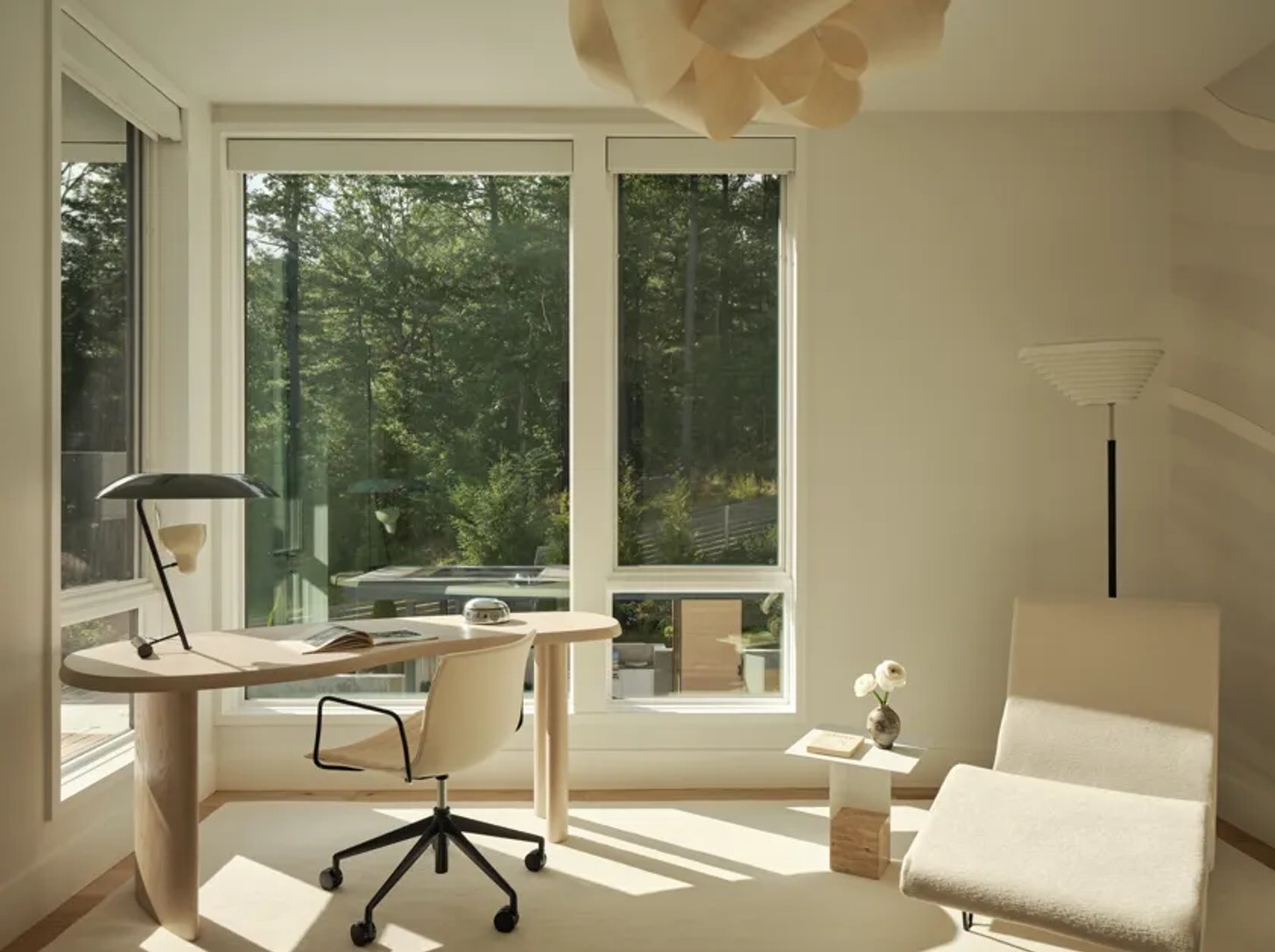
Don't match everything
The most successful monochromatic rooms aren't perfectly colour-matched.
Instead, allow some pieces to sit slightly outside your chosen shade. A deep walnut chair can bring depth to a room of warm neutrals, a dusty rose can soften a palette of burgundy, and a smoky blue can add dimension to an otherwise pale scheme.
Bring in pattern — carefully
Pattern isn't off-limits. In fact, it can be one of the easiest ways to stop a monochromatic style from feeling too controlled.
Look for stripes, checks, organic motifs, or abstract patterns that sit within the same colour group. A patterned curtain, rug, or occasional chair can introduce movement without disrupting the palette.

Play with light and shadow
A monochromatic room can change dramatically throughout the day, which is part of its appeal.
Natural light will reveal subtle differences between shades, while lamps and directional lighting can create pockets of shadow and warmth. Consider how the colour you choose behaves in both bright daylight and after dark before committing to it across the whole room.
Give the eye somewhere to land
Even the most tonal room needs a little tension.
A sculptural chair. A striking artwork. A vintage lamp. A dark timber table. A piece of stone with dramatic streaking.
These moments of contrast don't have to introduce an entirely new colour. Often, shape and material are enough to create the visual point that a room needs.
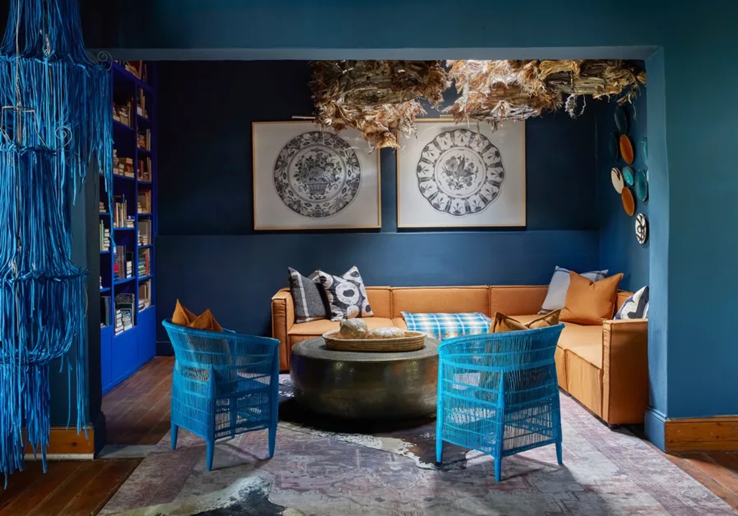
The golden rule
Don't think of monochromatic decorating as choosing one colour and repeating it everywhere.
Think of it as creating an exchange between different versions of the same colour – then letting texture, material, proportion, and light do the rest.
Image Credits
Greg Cox, Edvinas Bruzas, Tina Kulic, Douglas Friedman, Erin Little


