
This season’s preferred palette of retro-inspired hues is an ideal fit for bathrooms: it’s got enough statement appeal to work best in a contained space where it can be discovered as a sweet surprise. It’s also soft enough to make for a peaceful atmosphere in some of the most used areas of the home, with yesteryear’s “ugly” shades proving their comeback appeal.
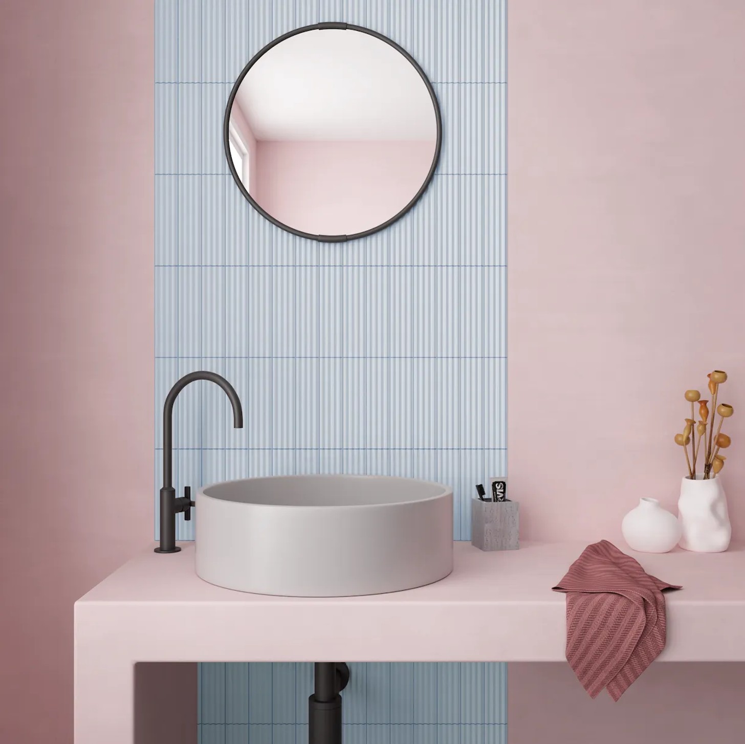
Part of why this year’s colour palette is a power move is that it’s not just present in the fleeting, easily changeable elements: homeowners are showing a commitment to their love of colour with tiles, sanware, appliances, and more longer-term investments in the bold shades that we’re often told to keep confined to accessories that can be switched out next season.

If you’re thinking of Barbie pink, bubblegum blues and soda pop green, or the super-sweet ribbon and cherry motifs that you’ve been seeing everywhere lately, you’re a tone or two off-course.
When it comes to candy colour, the season’s palette is more dusty sherbet and iridescent red lollipops than candy coating. Far from prissy and not exactly pretty, either, this palette is a grown-up, confident take on colour. It’s Fifties-by-way-of-the-Eighties, evoking a time of powder rooms, interiors a little more vivid and a little less beige, and being unashamed to take glamour seriously.
Before exploring these colours: why colour at all, after it’s been largely absent in our bathrooms and kitchens for quite some time? When Pantone’s choice of a whitish “Colour” of the Year fuelled a microoutcry online, was it an indication that we’re yearning for something a little more vivid? All signs suggest that yes, there’s a brighter future ahead (at least where colour palettes are concerned): WGSN’s pick of “Transformative Teal” as its colour of the year was in fact echoed in the rest of Pantone’s top colours for the season, with teal-adjacent Alexandrite making an appearance.
Burnished Lilac and Dusty Rose were colours spotted frequently on the runways of New York and London Fashion Weeks alongside chocolates and greens, and all of them are ready to answer the call for a natural alternative to neutrals. That brings us to the two most necessary, and chromatically neglected, rooms in the home.
For those of us who don’t have access to the first-prize option of a faithfully restored original kitchen from eighty to a hundred years ago, perhaps found after peeling off layers of white or cream paint, it’s necessary to make our own opportunities for tonally rich rooms.
Tiles
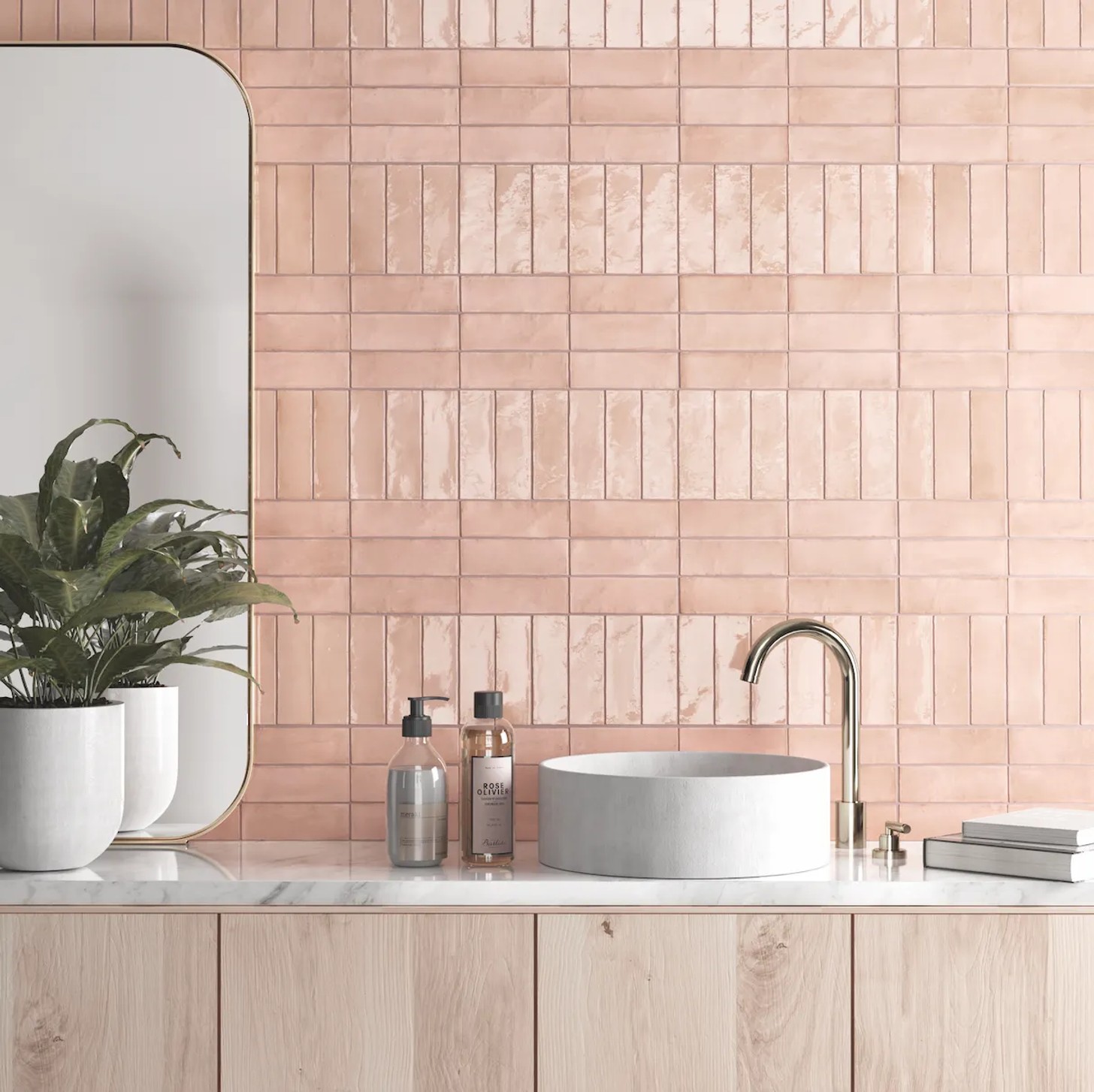
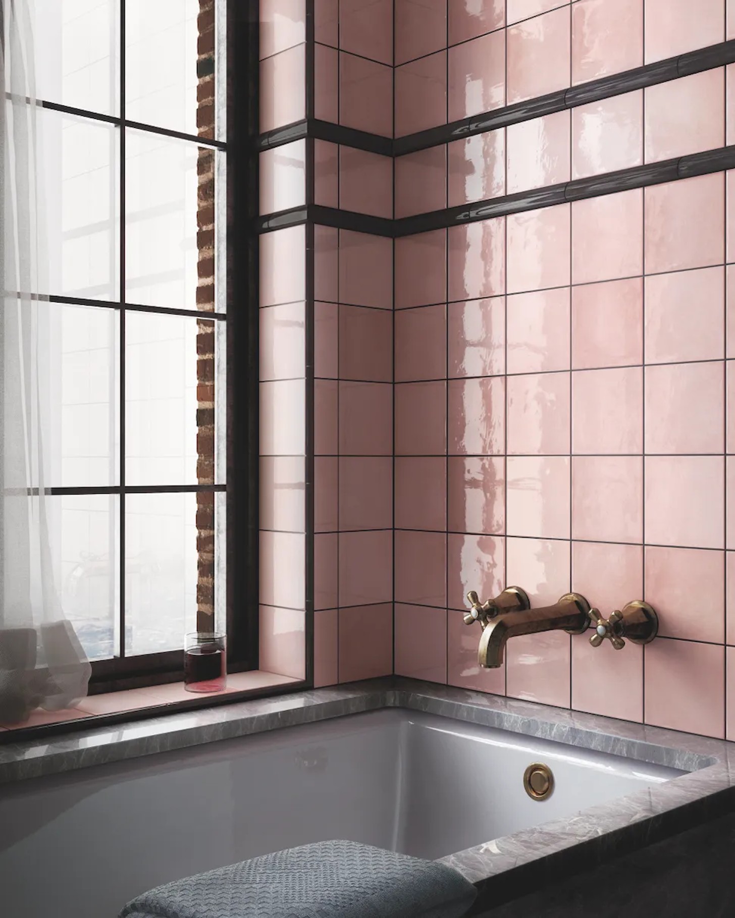
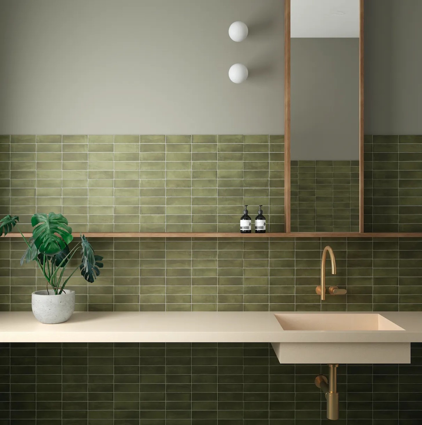
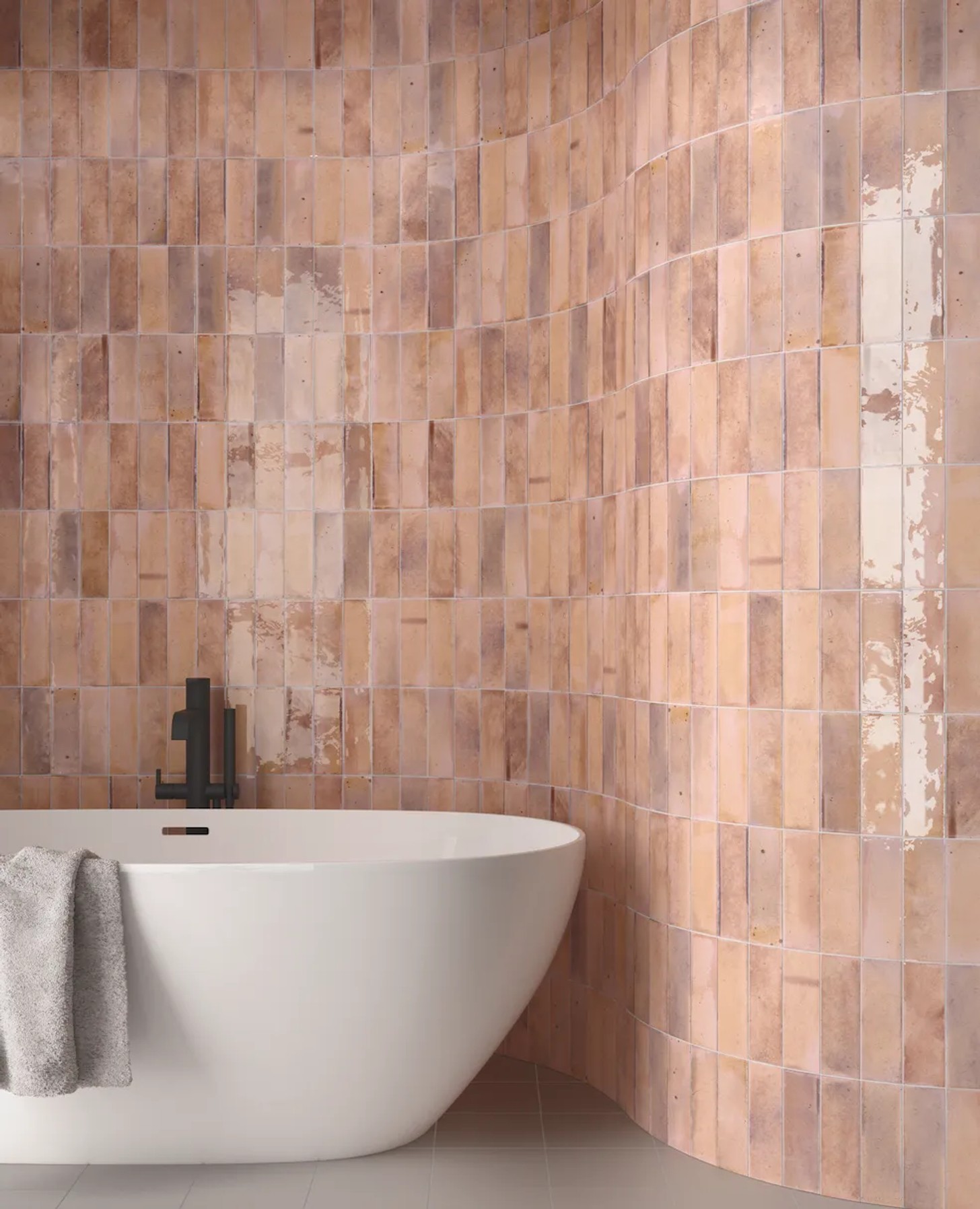
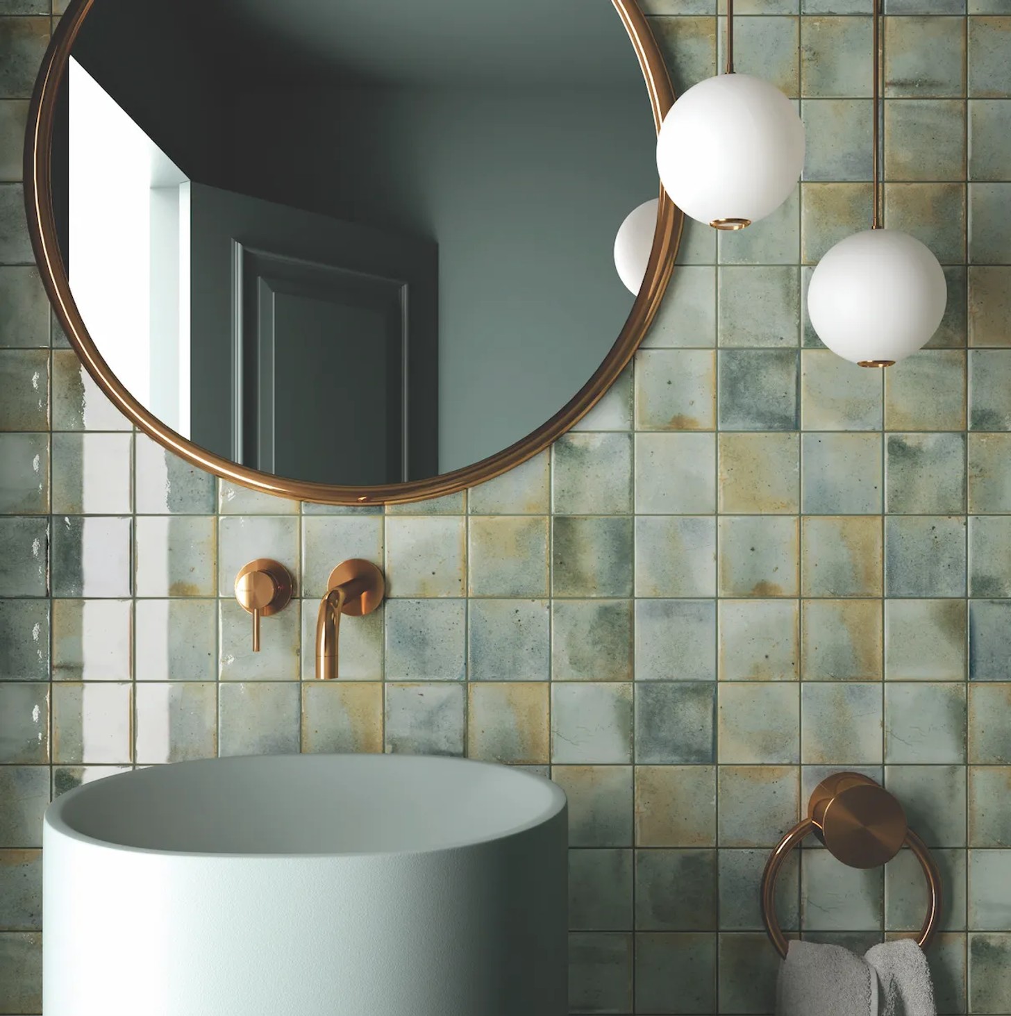
Subway tiles are still with us, square tiles are here to stay, and contrasting tiles are big: think colourful walls with black-and-white floors, or a large section of pale colour with a border of thin, dark, contrasting tiles. Because this season’s colour choices for tiles are mostly muted, dusty shades of pink, a glossy finish goes a long way to make things more romantic. Iridescent colour has a pleasant feeling of mother of pearl, undersea creatures, and mermaids, to go with the more matter-of-fact matt coral that’s a winner for walls.
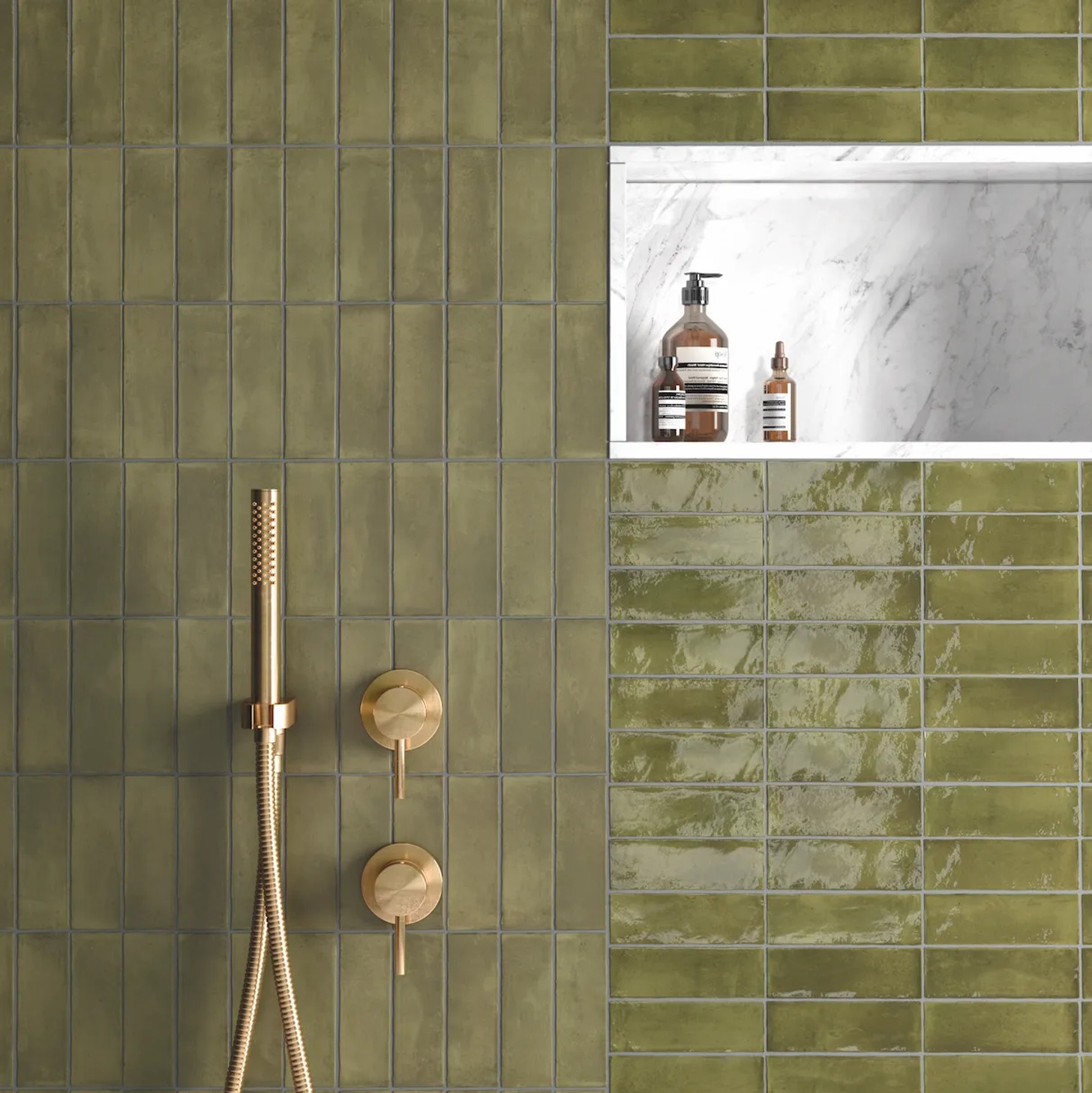
Then, there are the textures: if you were born before this millennium, the tiles you’re about to see a lot of are the same ones that’ll evoke instant nostalgia with their not-quite-solid colour. Before you know it, you’ll be transported back to a time before tiles were necessarily a flat and glossy slab of colour (or lack thereof): in all their dimpled, textured, crumpled looking glory, these are the bathroom features of an 80s or 90s childhood.
Fixtures
Sinks, basins, and baths are best kept simple in silhouette: they get to make their statement in colour, from teal to red, or yes – pink again. Butler sinks lend themselves well to becoming blocks of bold, rich, colour, while rounded above-counter sinks in a pastel tone are an appealingly unfussy touch in a bathroom. Then again, this is an ideal trend with which to try maximalism in a safe space, so if you want to go all out, why not? A world of glass, porcelain, and novelty shaped fixtures could be your oyster.
What millennials might once have called “quirky” or “so random” has been rebranded by Gen Z and Gen Alpha as “excellent use of free will” – no wonder so many of us are reclaiming spaces that look and feel like they actually mean something to us. Next time you hear that you should “Make your bathroom your sanctuary,” let it remind you that not all sanctuaries look the same.
Credits
Text by Cayleigh Bright
Images: Supplied


