
Colour is one of the most powerful tools in an interior designer’s vocabulary. It can alter the mood of a room, highlight architectural details, create visual connections between spaces and, perhaps most importantly, tell you something about the people who live there. While neutral interiors have long offered a dependable foundation, a more expressive approach is emerging – one where colour is no longer relegated to an occasional cushion or statement chair, but given a starring role.
For 2026, colour is becoming increasingly immersive. Colour drenching, for example, takes a single hue across walls, woodwork and ceilings, while more adventurous schemes use contrasting shades to create rooms with energy and personality.

Start With A Colour You Love
The best colourful interiors tend to feel personal rather than prescribed. Instead of beginning with whatever shade happens to be trending, start with a colour that genuinely appeals to you. It might be the deep green of a favourite landscape, the blue of a childhood home or the warm terracotta found in a treasured piece of pottery.
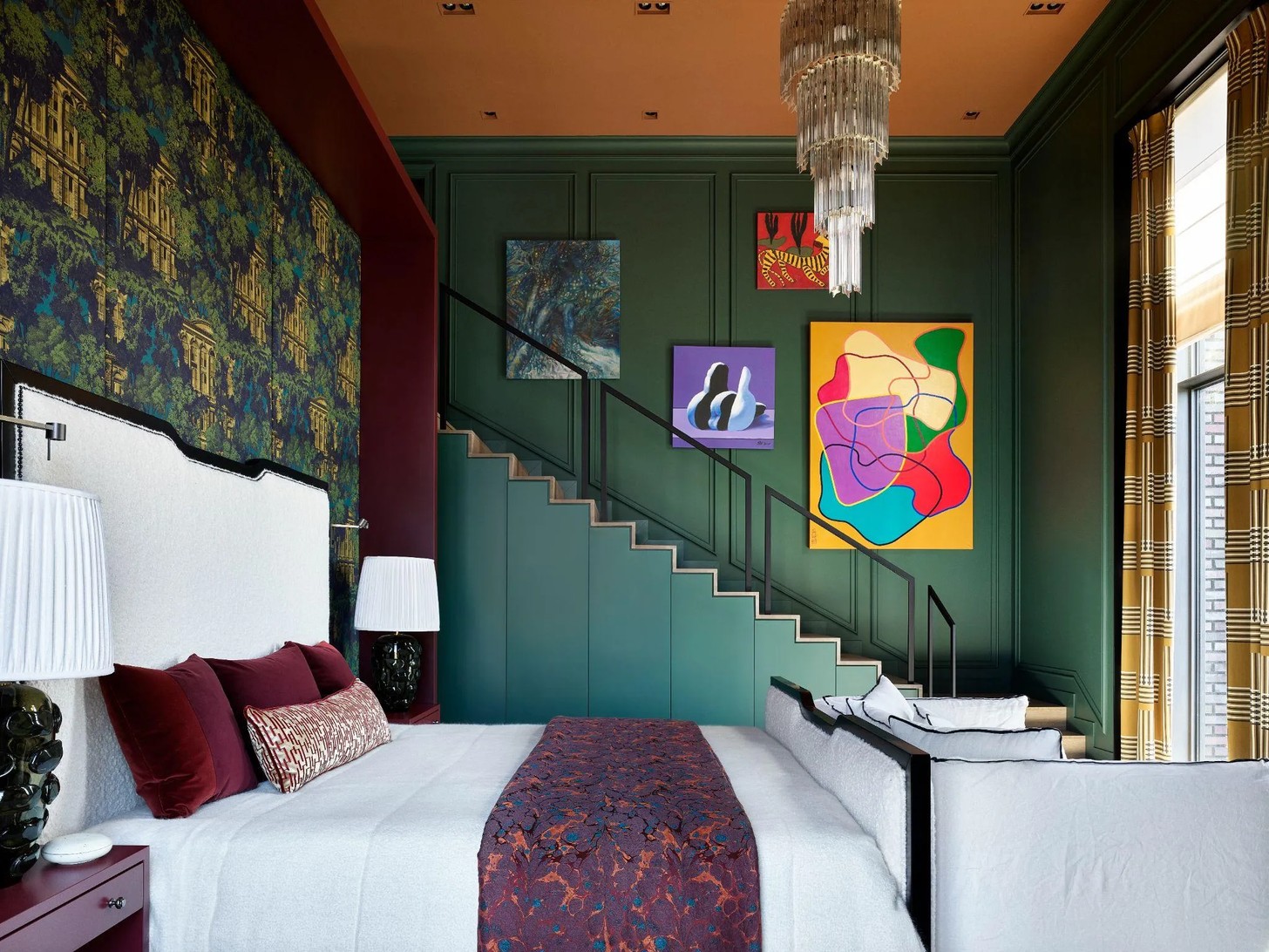
Once you have your starting point, consider its undertones and how it changes throughout the day. Natural and artificial light can dramatically alter the appearance of colour, so a shade that feels soft and welcoming in the morning may become considerably richer by evening.
Go Beyond The Accent Wall
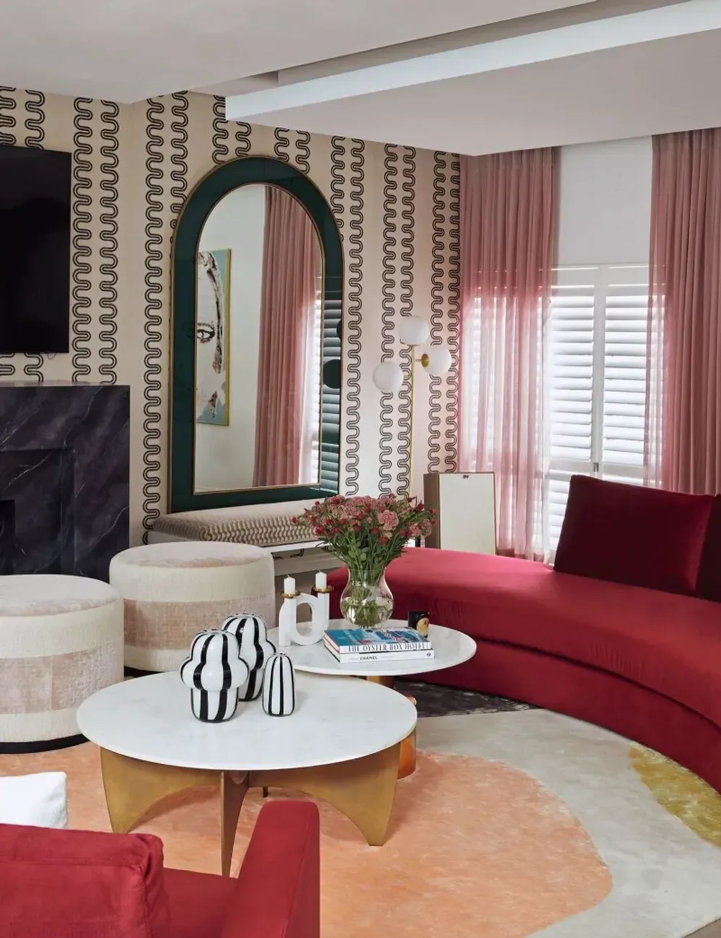
If colour is going to be the main character, it deserves more than a single accent wall. One of the most effective ways to create an immersive scheme is to extend colour across several surfaces.
Colour drenching can mean painting the walls, ceiling, doors, skirting boards and built-in cabinetry in the same or closely related shades. Rather than flattening a room, subtle differences in sheen and texture can create depth. Matte walls alongside a slightly more polished woodwork finish, for example, allow one colour to take on several personalities.
Create Contrast With Confidence
A colourful room does not need to be built around one shade. In fact, some of the most memorable interiors come from unexpected colour combinations.
Try pairing warm and cool tones, or placing a rich jewel shade alongside something softer and chalkier. Deep aubergine can sit beautifully with dusty pink, while cobalt blue can be energised by mustard yellow or softened with earthy neutrals. The trick is to establish a visual hierarchy: allow one or two colours to dominate, then use smaller doses of contrasting shades throughout the room.
Let Furniture Join The Conversation
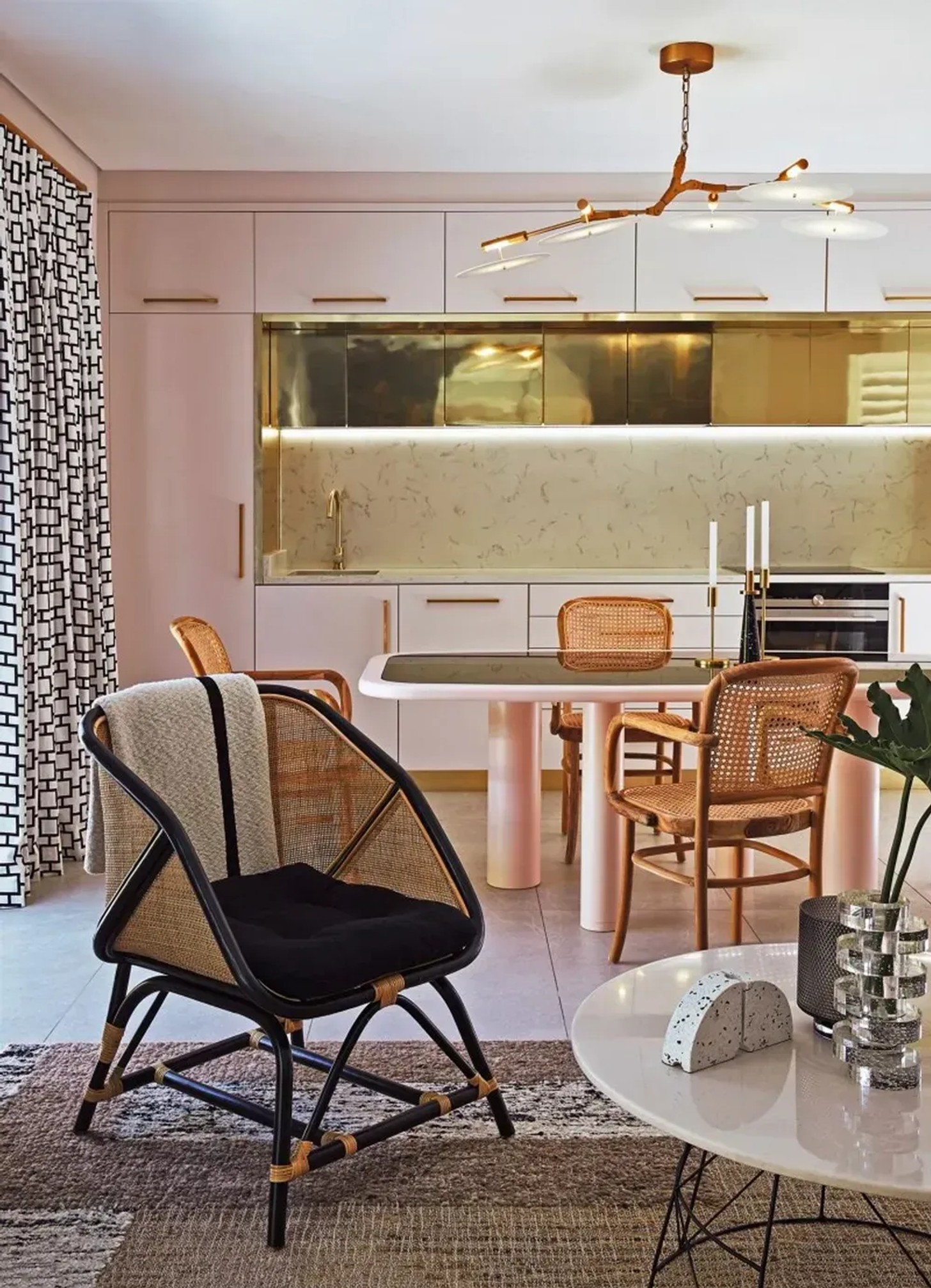
Colour does not have to come from paint. Furniture is an equally effective way to introduce strong shades, particularly if you are reluctant to commit to a fully colourful room.
A saturated sofa, painted cabinet or pair of brightly upholstered dining chairs can become an anchor around which the rest of the scheme develops. Repeat elements of that colour in artwork, cushions, lamps or ceramics, but resist the temptation to match everything perfectly. Variation keeps the room feeling layered rather than overly coordinated.
Use Neutrals To Give Colour Space
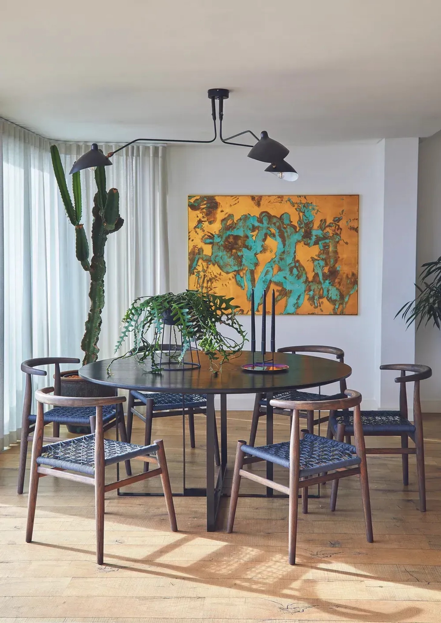
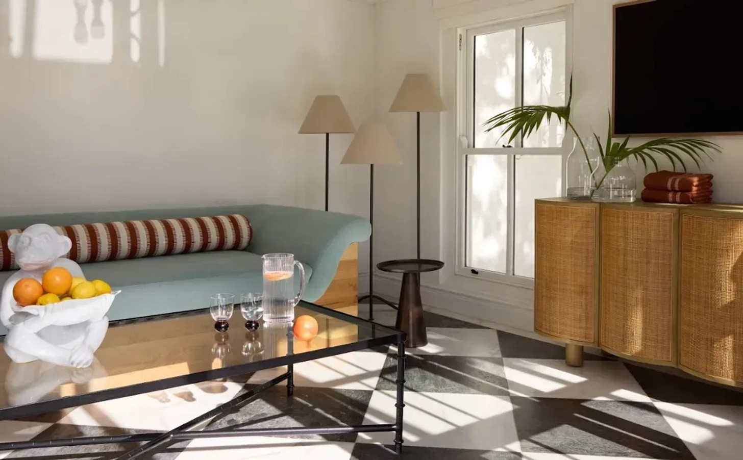
Even the boldest colour schemes benefit from moments of restraint. Natural timber, stone, woven materials and warm off-whites can give saturated colours somewhere to breathe.
This is particularly useful when working with several strong shades. Instead of introducing another colour, consider using texture or a natural material to create contrast. A richly painted wall against pale timber flooring, for example, can feel dramatic without becoming overwhelming.
Make It Personal
Ultimately, making colour the main character is less about being bold for the sake of being bold and more about creating an interior that feels unmistakably yours. The most successful colourful homes are not those that simply contain the most colour; they are spaces where every shade has a reason to be there.
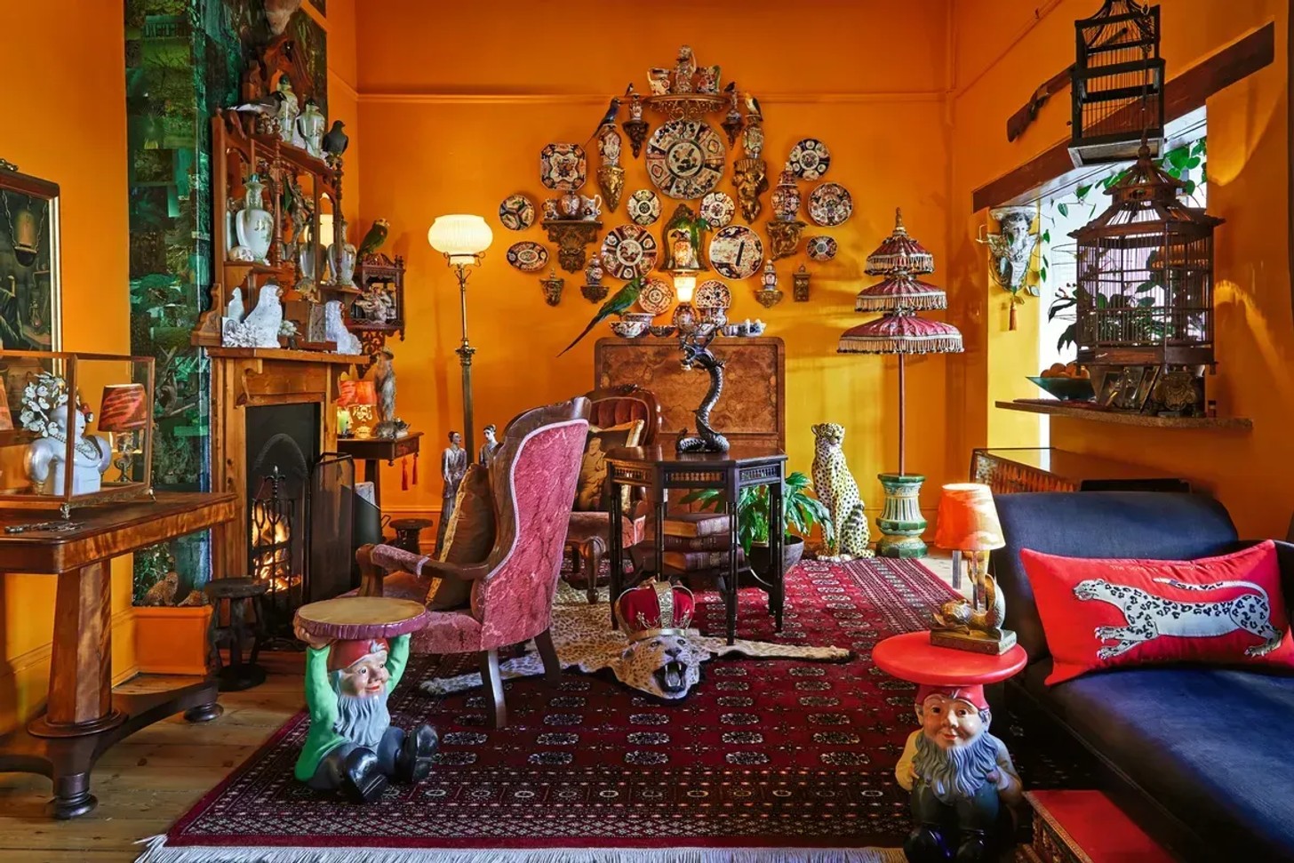
So paint the ceiling. Upholster the chair. Put cobalt in the kitchen or burgundy in the bedroom. If a colour makes you happy, there is a good chance it belongs in your home. In 2026, as interiors continue moving towards richer, warmer and more individual schemes, confidence may be the most important colour rule of all.
Credits
Images: Inge Prins, Sergey Ananyev, Elsa Young, Greg Cox


