
Some interiors begin with a particular architectural idea, while others take their cues from a collection, a building’s history, or even the way a family navigates through their daily life.
This apartment began somewhere more personal: with its owner.

A young, charismatic public figure whose private life remains deliberately out of frame, the client came to the project with a clear sense of what they wanted. The brief was not simply to furnish a developer’s showroom apartment, but to turn it into a home that felt distinctly his own – a place to stay for a few days, spend time with family, display art and awards, and arrive without feeling that anything was missing.
The apartment comprises a kitchen and living room, two master bedrooms, two walk-in closets, four bathrooms, and a laundry room. While the developer had already established the layout, designer Liubov Pivovarova approached the interiors as an opportunity to give the existing architecture a stronger identity.
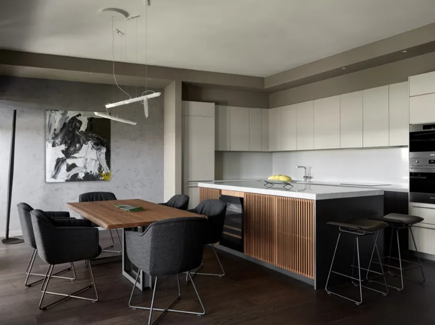
The starting point was music. The client’s favourite band, Thirty Seconds to Mars, became an unlikely but influential reference for the scheme. So instead of translating the band into a literal theme, Pivovarova drew from its energy – its graphic quality, contrast, and intensity.
This resulted in an interior defined by a restrained palette of black, white and graphite, softened by natural veneer and layered with glass, ceramics, and marble.
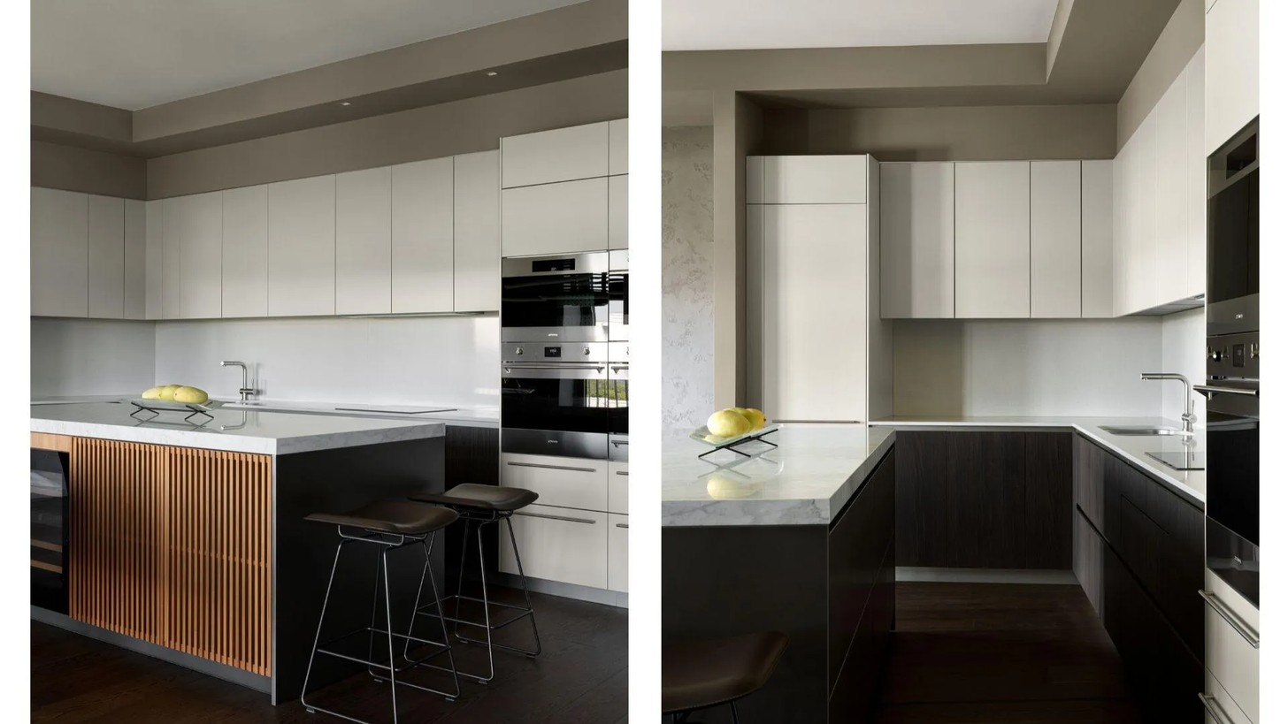
The limited colour palette allows the materials to do the talking. Across the apartment, variation comes through texture, scale, and proportion rather than an abundance of colour. It gives the home a strong contemporary edge, but the intention was never for it to feel like a showroom or exhibition space. Beneath the striking finishes, it needed to remain a home.
An entrance that doubles as a gallery
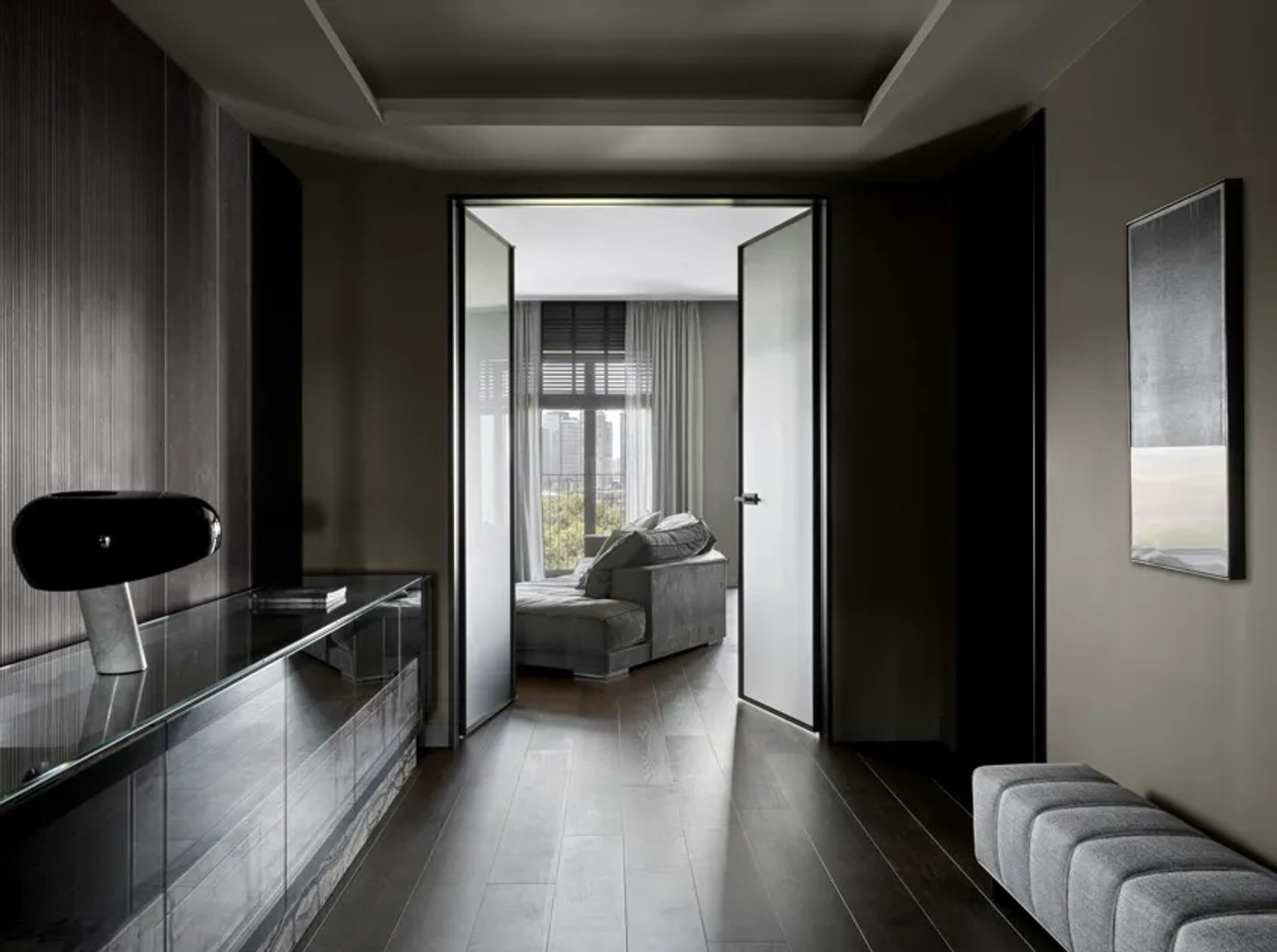
The entrance hall sets the tone for what follows. Behind the Henge console, an Inalco finish creates a textured backdrop, accompanied by a Minotti ottoman and artwork by Kristina Agelskaya.
Elsewhere in the hall, a Poliform Surface mirrored cabinet is paired with Inalco architectural ceramic panels and textile panels with a wild-silk texture. Baxter wall sconces add another layer of graphic detail.
However, the hallway serves a purpose beyond welcoming guests. The client regularly receives artworks as gifts, so the designer created space for these pieces to live within the apartment. Over time, this area has become something of a personal gallery, allowing art to be experienced as part of everyday life.
A living room made for gathering
The project began with the kitchen and living area, and it was some time before the client saw the result in person. Having approved the work remotely, he subsequently decided to continue with the rest of the apartment. Pivovarova’s team then oversaw the project from concept through to completion, with decisions approved online.
In the living room, bringing people together was central to the brief. A large dining table became an important anchor – a beautiful space for family and friends to gather.
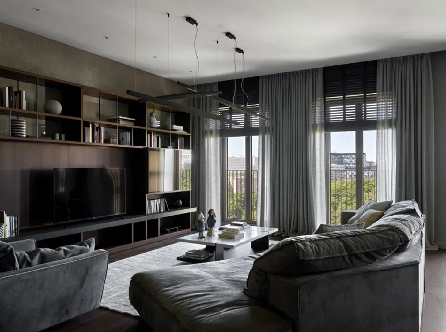
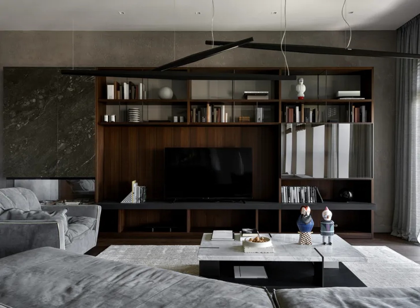
The monochrome scheme was Pivovarova’s proposal, helping the kitchen and living areas flow naturally into one another. A Baxter sofa and armchair sit alongside a Poliform coffee table, while pendant lights by Panzeri and Vibia add a sculptural, graphic quality overhead.
The television area was treated with equal consideration. A bespoke Molteni & C 505 System shelving unit combines veneer and glass, becoming part of the architecture rather than reading as a freestanding storage piece.
A master bedroom tailored to its owner
Since the apartment’s architecture had already been established by the developer, the master bedroom was not reconfigured. Instead, Pivovarova concentrated on making the existing space work better for its owner.
One of the most personal additions is a beauty zone: a mirrored, backlit niche with display cases for perfume and other everyday possessions. It brings a practical element of the owner’s routine into the design without compromising the room’s clean aesthetic.
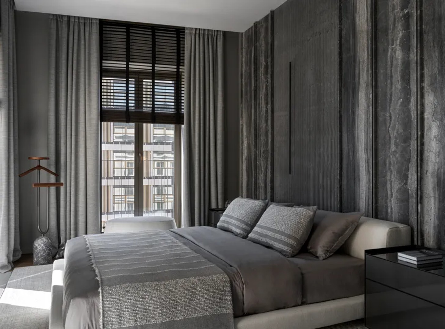
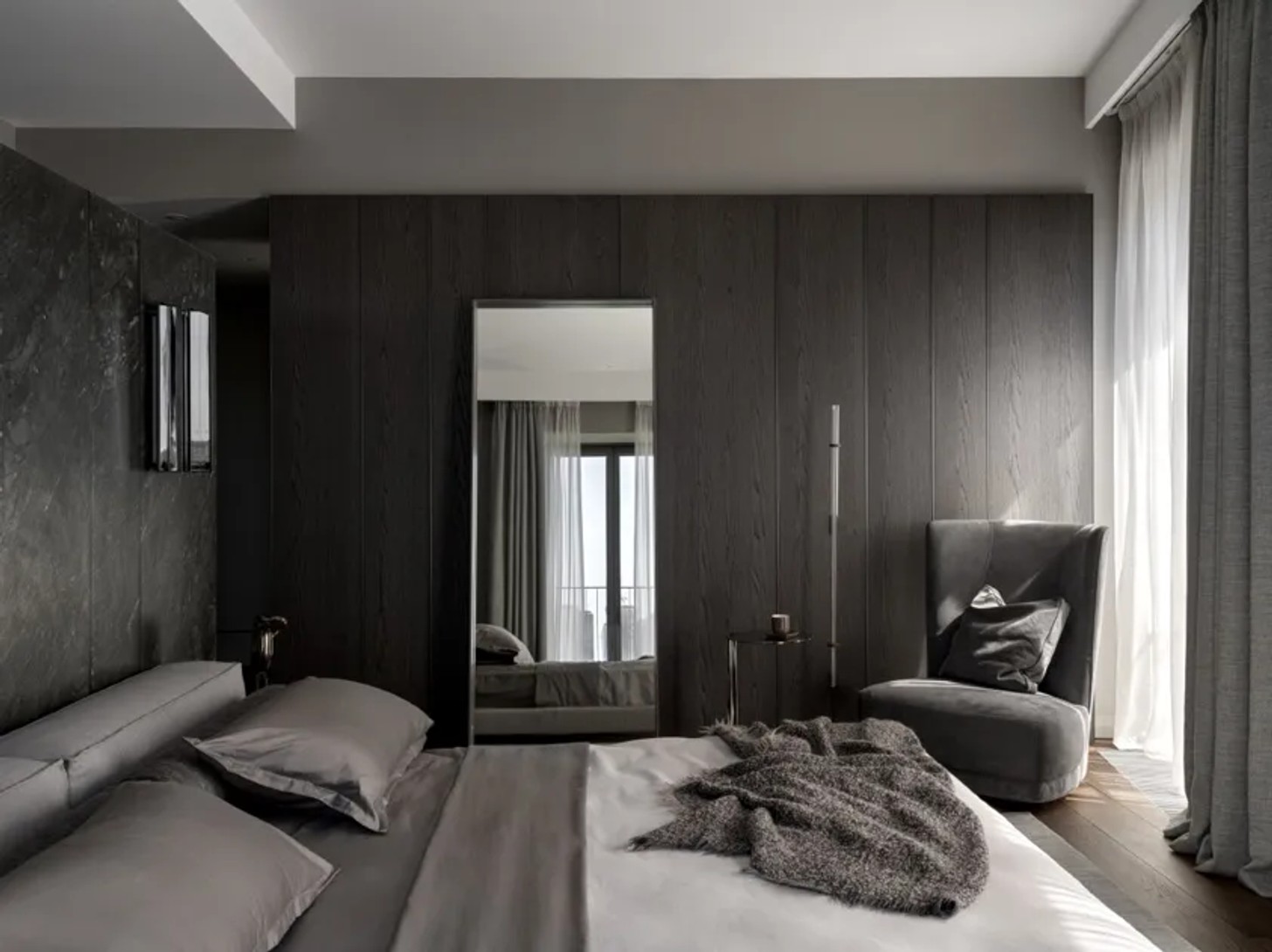
Behind the bed, a Molteni & C boiserie panel system is finished in the same surface as the built-in wardrobe. The two elements align in height, allowing the wall and storage to read as one continuous architectural feature.
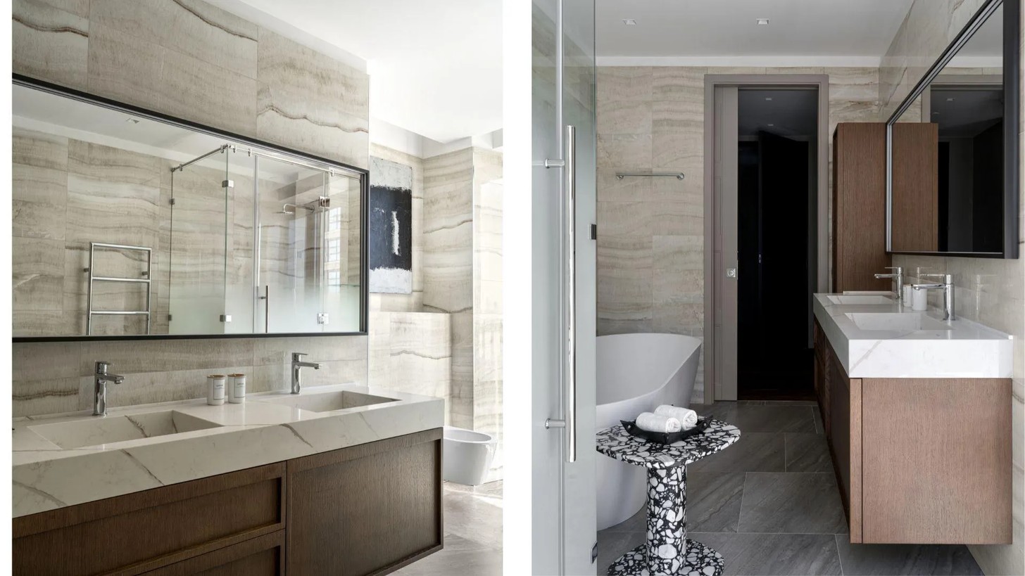
The master bathroom was similarly refined. The original engineered-stone bath was replaced, while the cabinetry and mirrors were updated to give the room a more contemporary feel and bring it into the same feel as the rest of the apartment.
A marble-clad guest room
The second master bedroom was originally intended for the client’s parents. Its defining feature is the wall behind the bed, where a single slab of Italian marble was transformed into a series of custom-made panels.
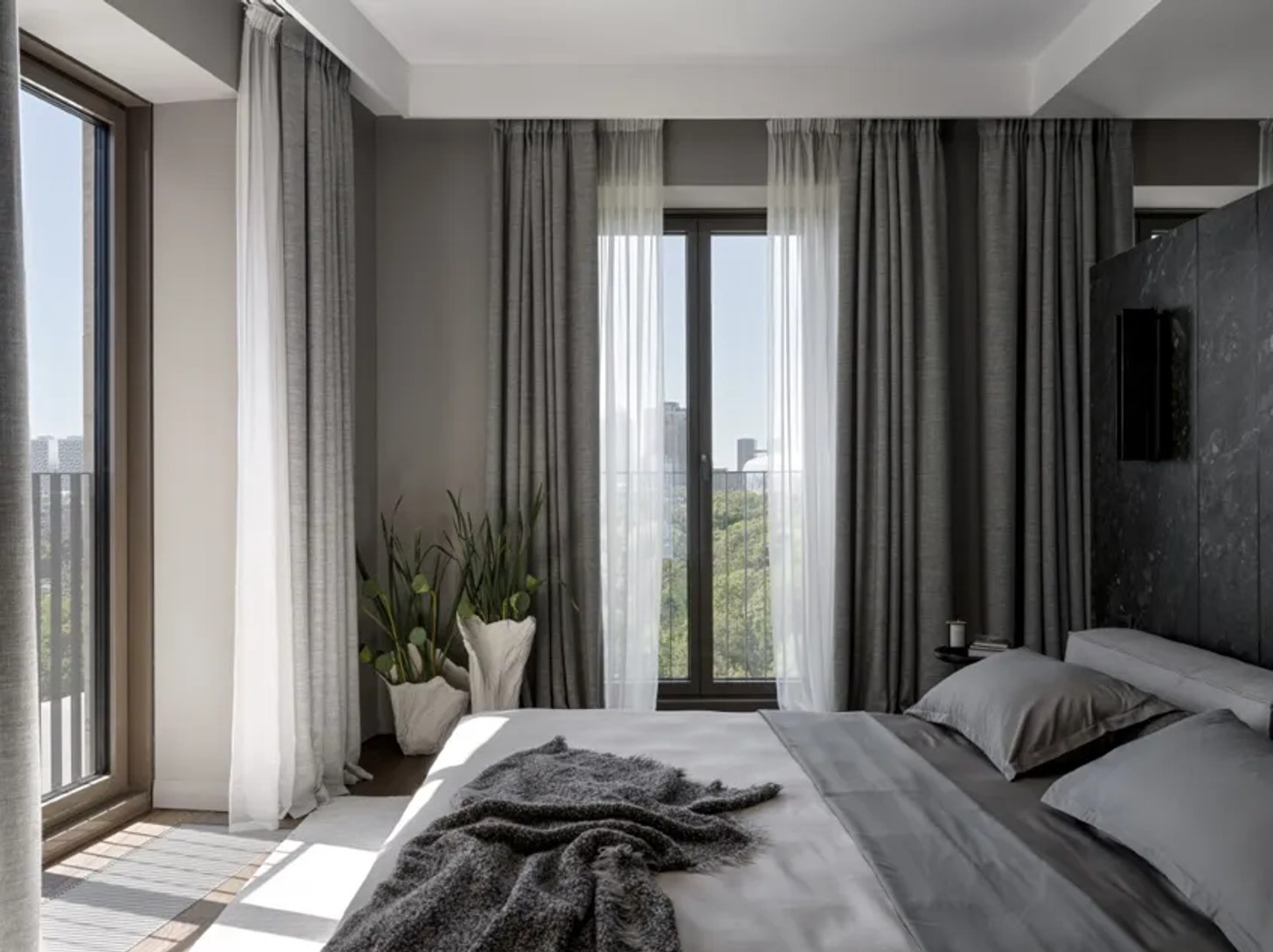
The installation demanded considerable technical planning. The panels required engineered bending radii, while the wall had to be reinforced to accommodate the weight and form of the marble. What might initially appear to be a simple material choice became one of the apartment’s most technically involved details.
Designed for a life between visits
One of the most important considerations throughout the project was the client’s lifestyle. He visits the apartment only occasionally, so it needed to operate almost independently – with everything in its place and no sense that the home was waiting to be completed.
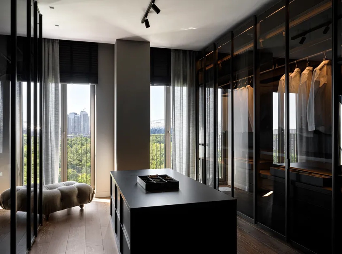
At one point, the designer considered turning the walk-in closet into a music room. Ultimately, a separate wardrobe proved more useful.
That decision reflects the wider thinking behind the apartment. Its many built-in and individual elements are not there simply to make a visual statement. They help organise the practicalities of living, from clothing and personal belongings, to art and awards.
The result is an apartment that feels personal without being too literal. Its identity comes through the music that inspired the original direction, the restrained palette, expressive materials, integrated storage, and artwork that has found its place over time.
Most importantly, it is an interior shaped around a person as opposed to a prescribed style – contemporary, highly considered and, despite its polished finish, unmistakably a home.
Credits


