
There are few South African landscapes with quite the visual clarity of the Karoo. Its vast horizons, dry grasses, rugged mountains and weathered farm buildings create a palette that feels simultaneously muted and intensely atmospheric. In interior design, these colours offer a way to bring some of that sense of space and stillness indoors.
Rather than treating the Karoo palette as a strict collection of shades, think of it as an exercise in looking. The landscape moves constantly between warm earth, dusty stone, pale sunlight and deep shadow. It is this subtle variation that makes the colours so useful at home.

Start With Earthy Terracotta
Terracotta is perhaps the most immediate colour to associate with the Karoo. It recalls baked earth, clay, rusted metal and the warm glow of the landscape at sunset. Used on walls, it can make a room feel enveloping without becoming overly dark, while terracotta-toned upholstery, rugs or ceramics offer a more restrained introduction.
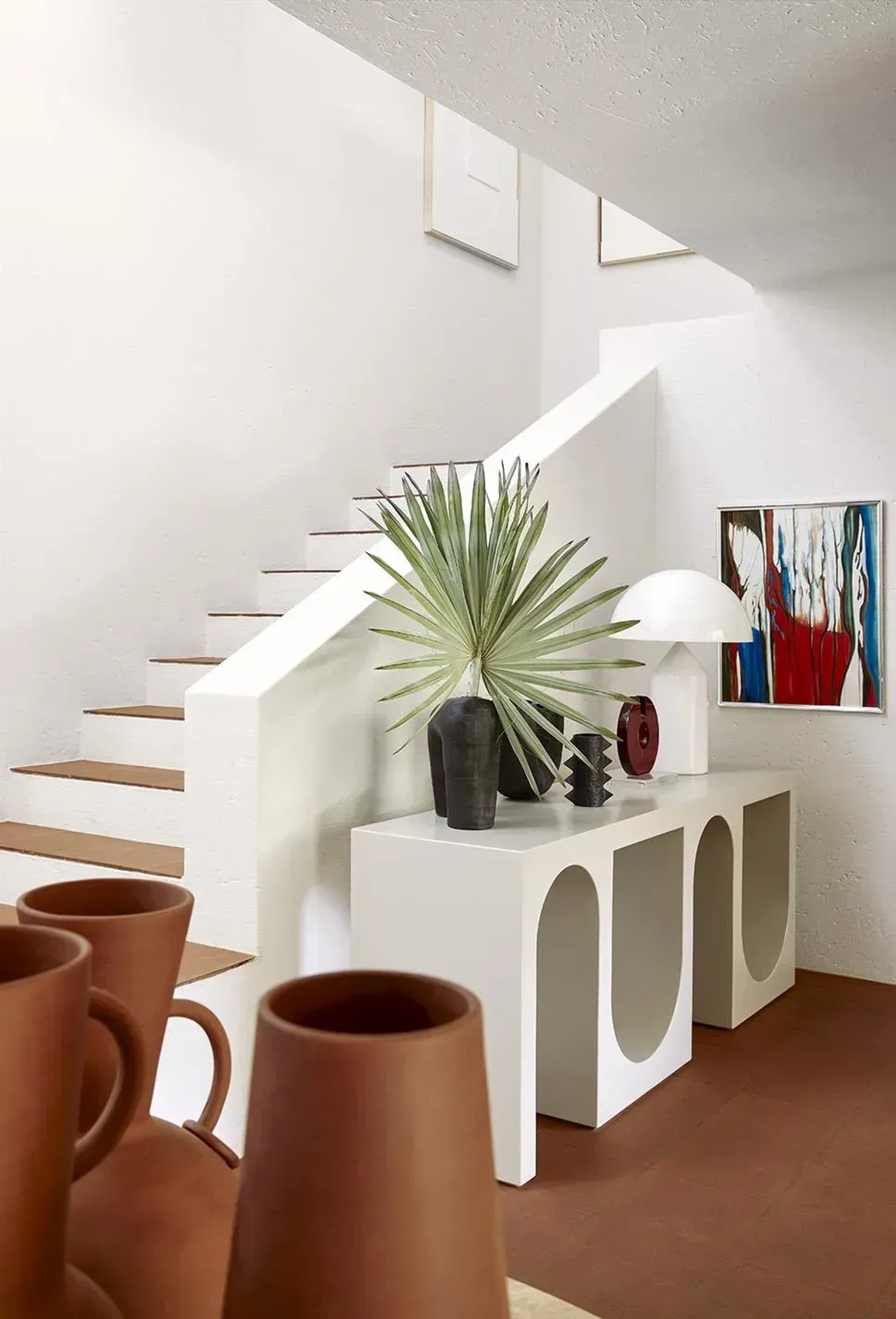
The key is to avoid making the colour too perfect. Karoo-inspired interiors benefit from shades that feel sun-faded, chalky and slightly weathered rather than intensely saturated.
Layer In Sand And Stone
If terracotta provides warmth, sandy beige and stone create the foundation. Think limestone, pale sandstone, dusty taupe and warm grey rather than cool, blue-toned neutrals.
These shades work particularly well across large surfaces, from walls and flooring to sofas and curtains. Layer several slightly different tones together and the result becomes much more nuanced than a single neutral shade. It also creates the kind of quiet backdrop that allows artwork, furniture and collected objects to take centre stage.

Bring In The Dry-Grass Palette
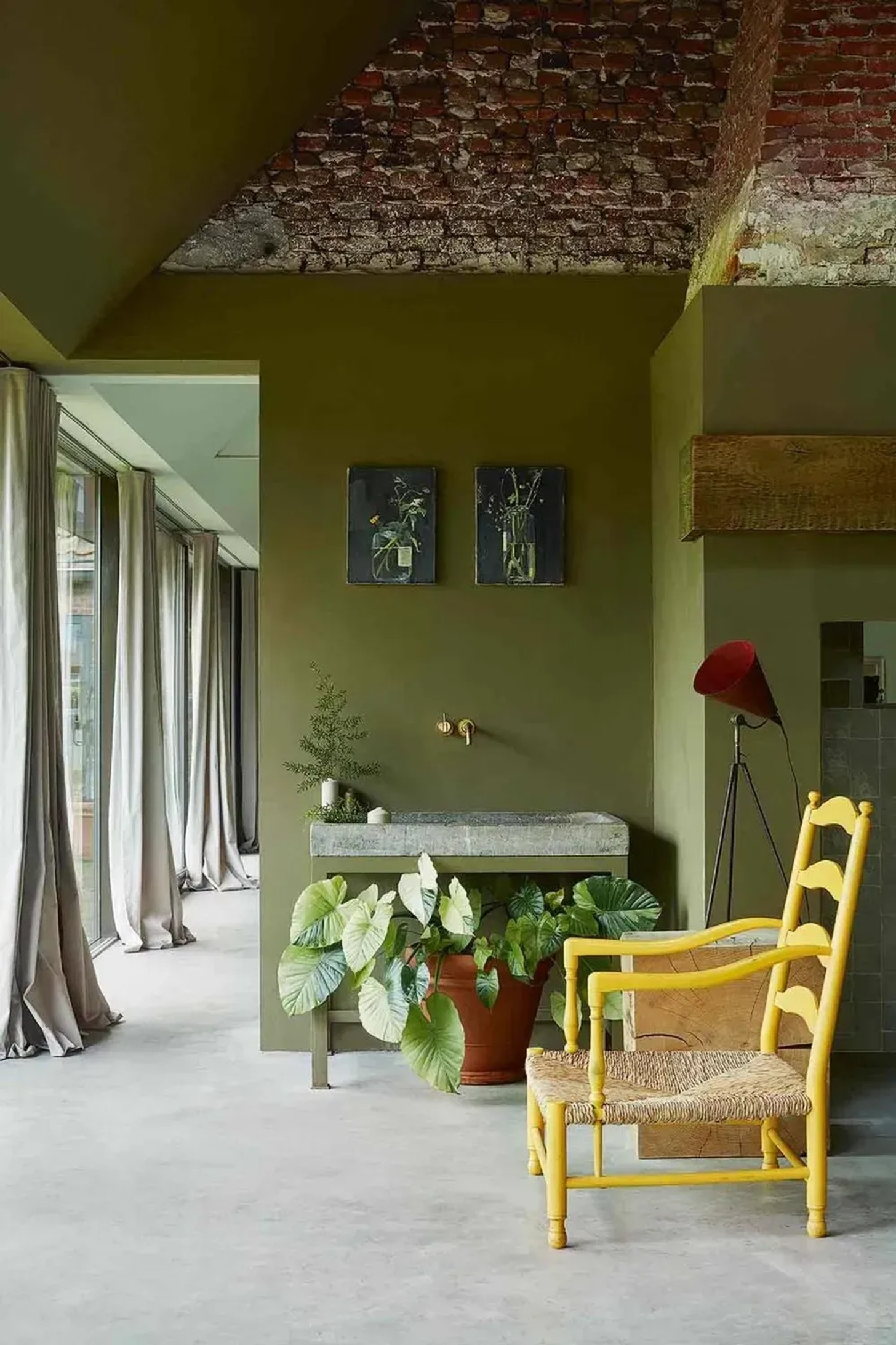
Look closely at the Karoo landscape and you'll find an extraordinary range of greens. They are rarely lush or jewel-toned; instead, they appear as faded sage, olive, khaki and silvery green.
These colours are particularly effective in bedrooms, studies and living spaces where you want to create a calm atmosphere. Introduce them through painted cabinetry, linen curtains, upholstery or smaller decorative pieces. Pairing muted green with warm timber and natural stone keeps the scheme grounded.
Don't Forget The Sky
The Karoo is not only about earth. Its enormous skies provide some of the landscape's most striking colour, shifting from almost white at midday to dusty blue, grey and deep indigo as the light changes.
A muted blue can bring a cooler counterpoint to terracotta and ochre, particularly in rooms that receive strong sunlight. For something moodier, a deep blue-grey can create an atmospheric dining room or study without losing the warmth of a natural palette.

Add Ochre And Golden Tones
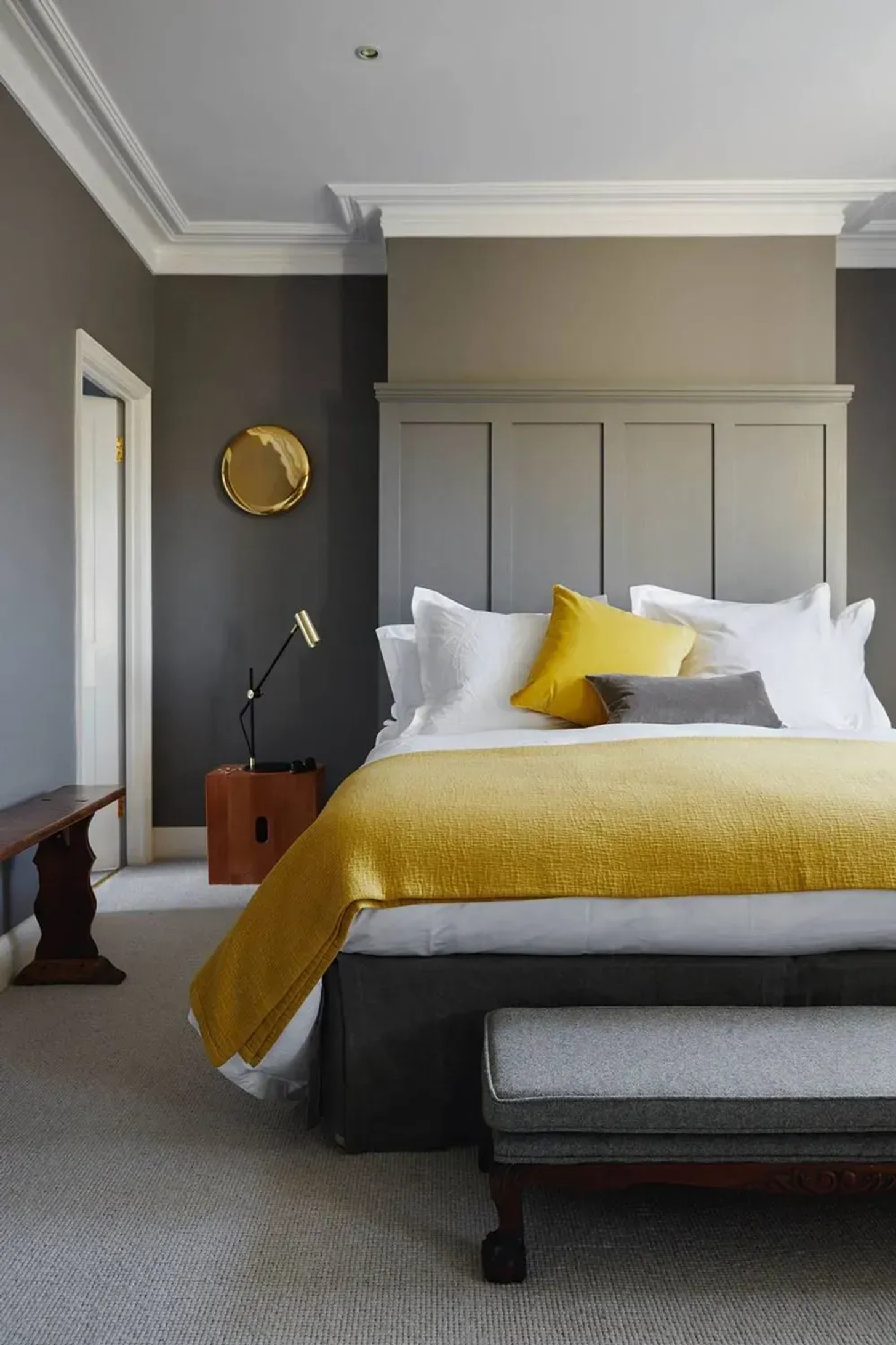
In the late afternoon, the Karoo takes on a golden quality. Ochre, straw, camel and sun-washed yellow can capture this warmth without making an interior feel overtly colourful.
Use these shades sparingly through cushions, artwork, lampshades or a single upholstered chair. They are especially effective alongside earthy reds and browns, where they create the feeling of late-afternoon light.
Let Texture Complete The Palette
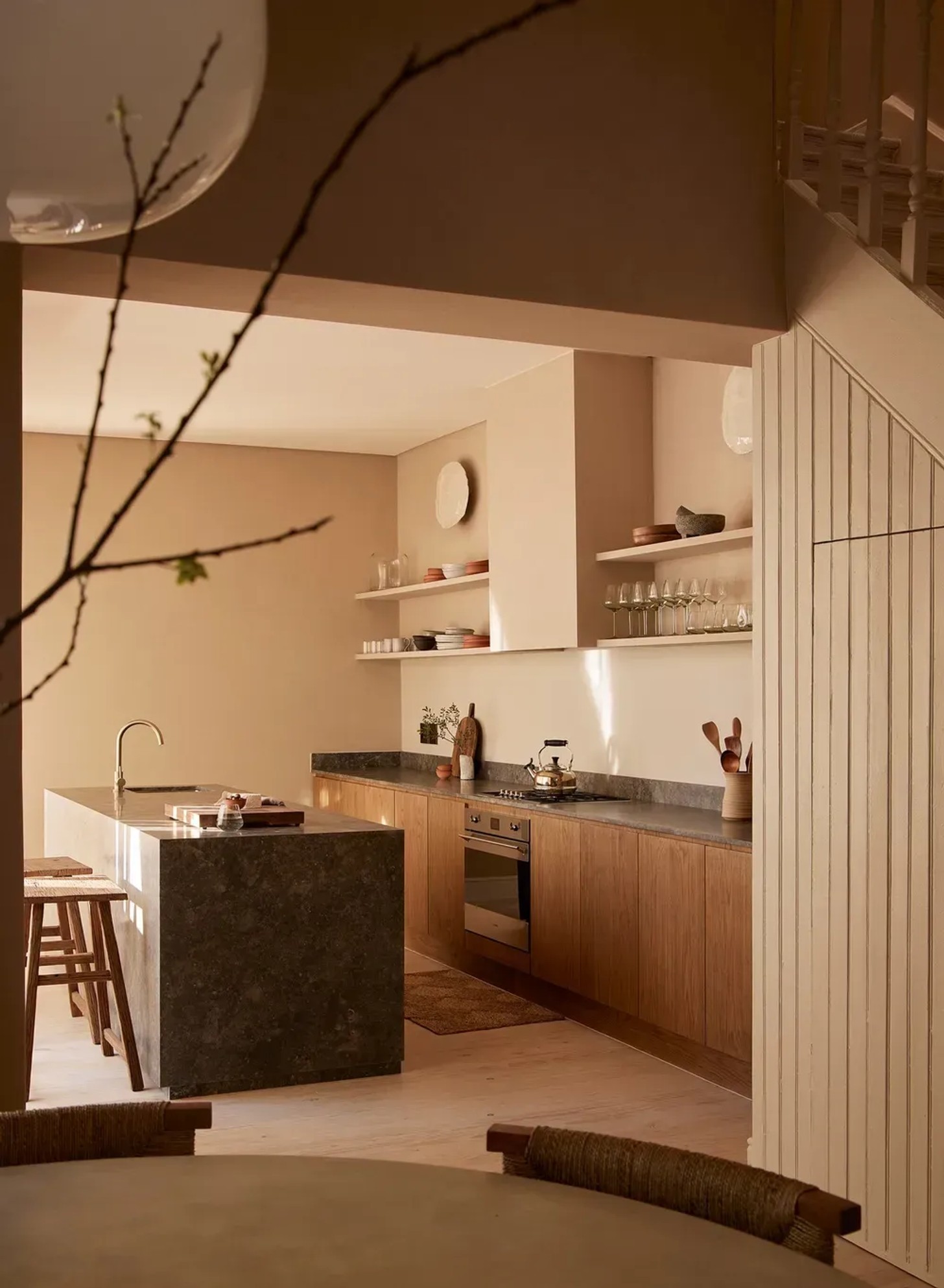
Colour alone cannot recreate the Karoo. Texture is what gives these shades their depth. Think raw timber, linen, woven grass, wool, aged leather, handmade ceramics and natural stone.
These materials introduce small variations in tone and surface that make a room feel organic. A plaster wall catches the light differently from linen; a rough stone surface sits differently alongside polished wood. Together, they create the imperfect richness that makes a Karoo-inspired palette feel authentic.
Keep It Quiet And Collected
The most successful interpretation of Karoo colours isn't necessarily a literal one. There is no need to fill a room with every shade found in the landscape. Instead, choose two or three dominant colours and build around them with natural materials and considered accents.
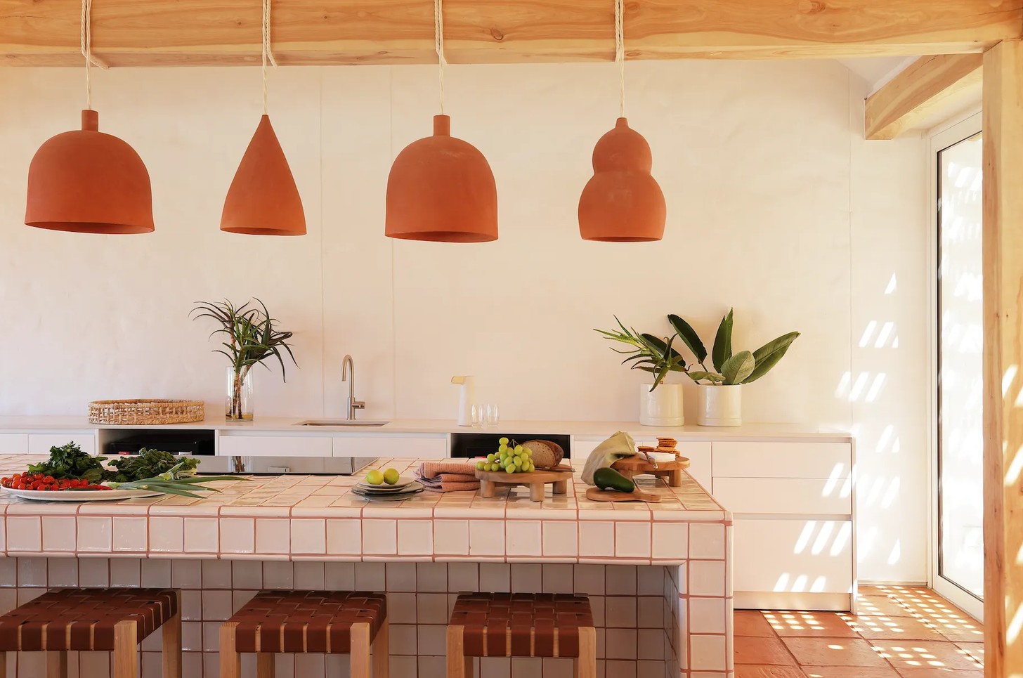
The result should feel warm, grounded and slightly weathered — a home that borrows the Karoo's greatest design lesson: beauty can be found in restraint, imperfection and the changing light.
Credits
Images: Adam Letch, Elsa Young, Joachim Wichmann, Ngoc Minh Ngo, Benoit Linero, Lucas Allen, Inge Prins, Henrique Wilding


